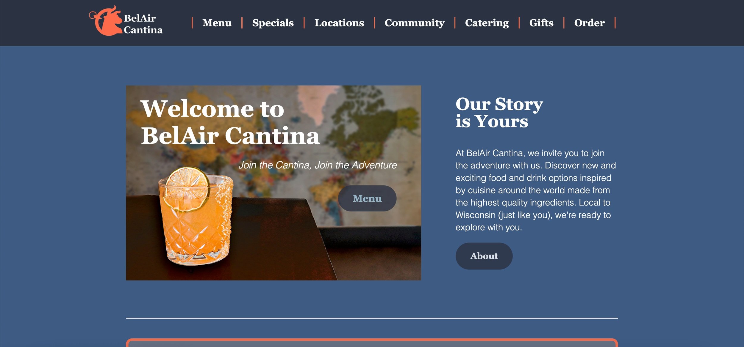
BelAir Cantina
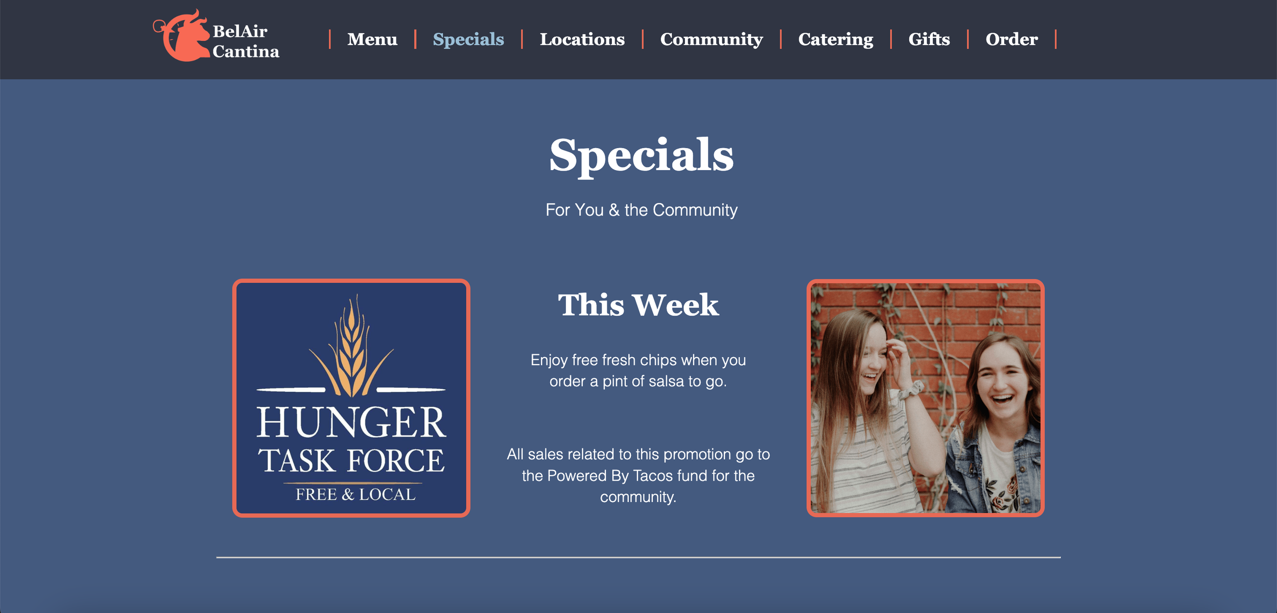
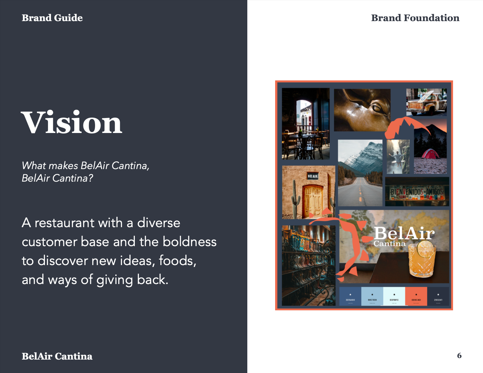
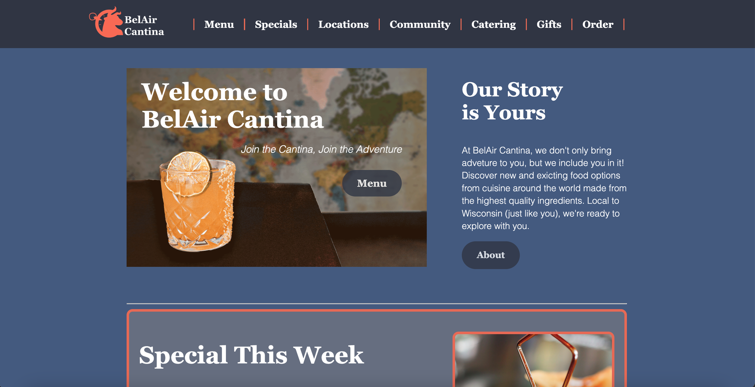
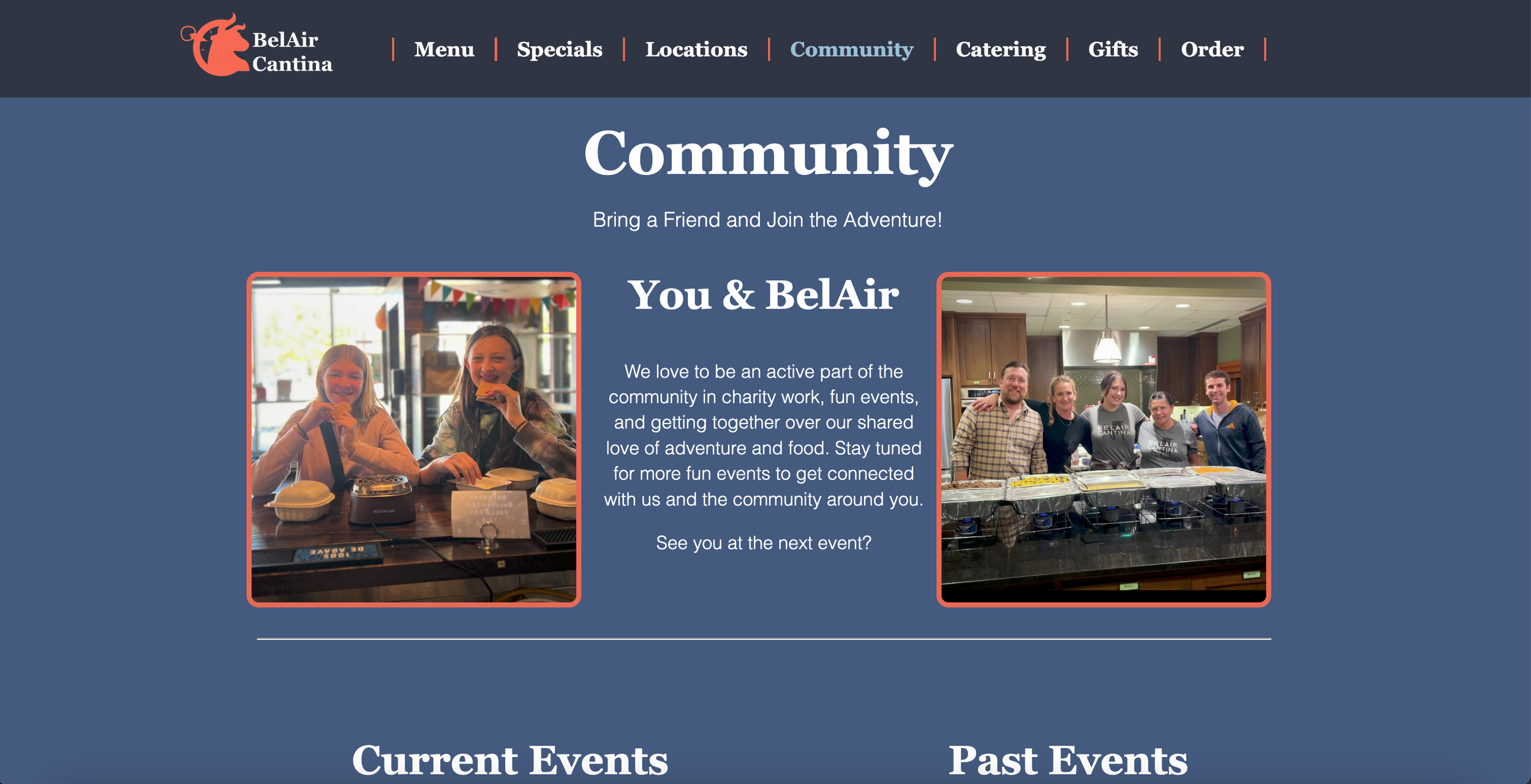
Created a mock rebrand of BelAir Cantina to shift branding archetypes from the Jester to the Explorer. Now the Cantina doesn’t derive it’s boldness from it’s chaos, but from it’s sophistication.

The Process
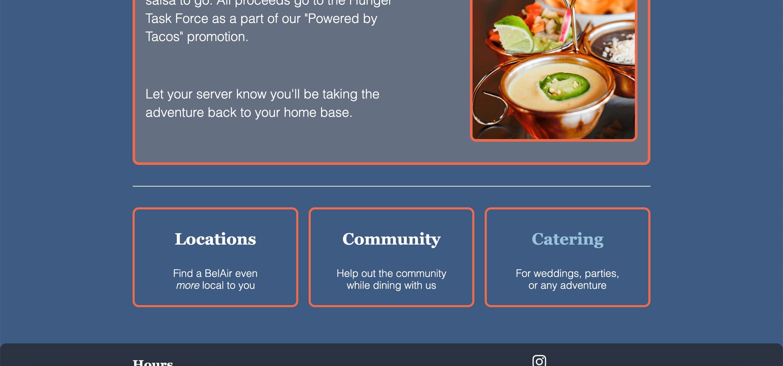
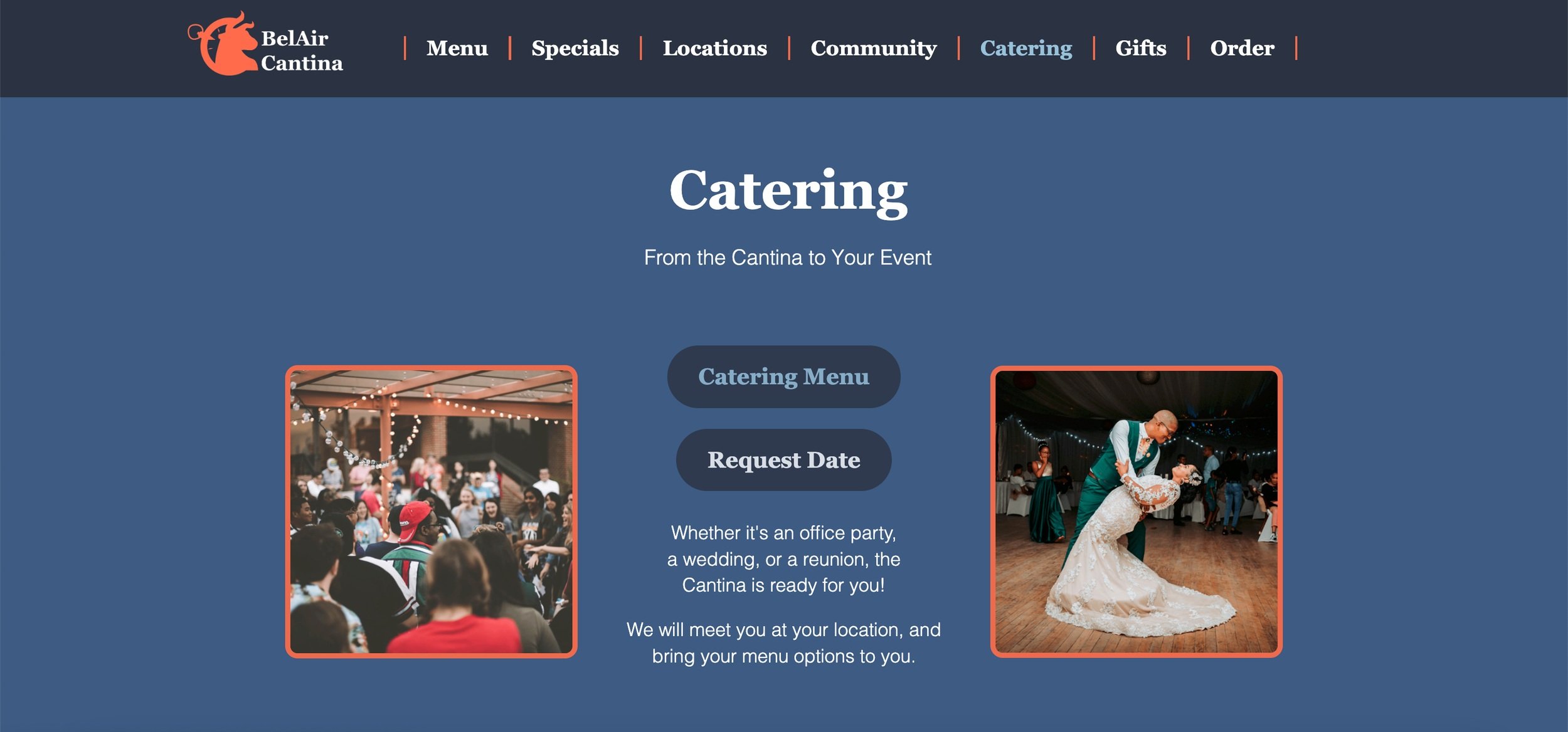
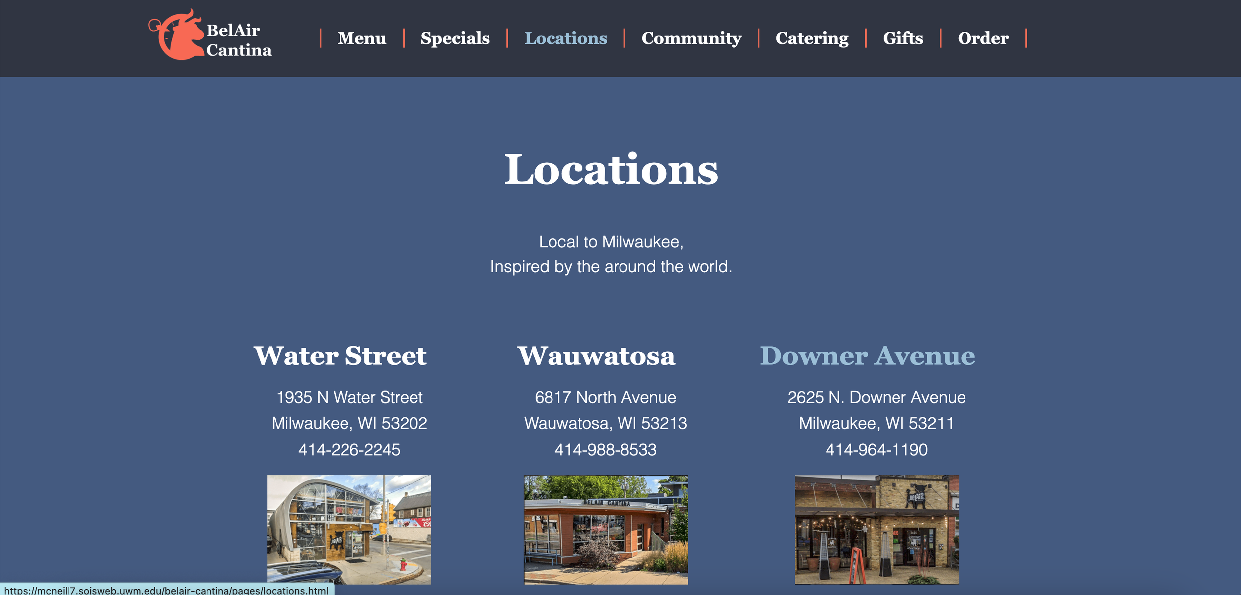
I took the brand from a chaotic and fun feeling to a sophisticated and bold experience. This was done through the sophistication of the logo, using a typeface that complemented the boldness and curves of the logo, the colors being bold and warm, and the language shift. The archetype shift was successful as a new message was communicated to include a broader audience, one that may have been intimidated by BelAir’s zany menu, allowing them to be included in the adventure of the Cantina.