Fast Fund at Matc
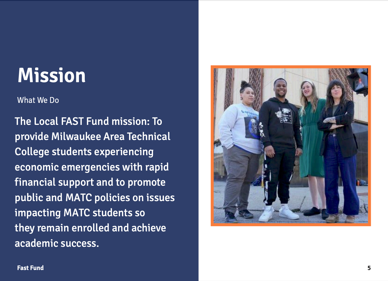
Working as the graphic designer on the team, I took charge of the rebrand of Fast Fund at MATC. We took it from a money-centric design and shifted to a people-centered design. This included increase in accessibility (alt text, branding consistency, color palette), consistency (brand guide), and a modern design.

The Process
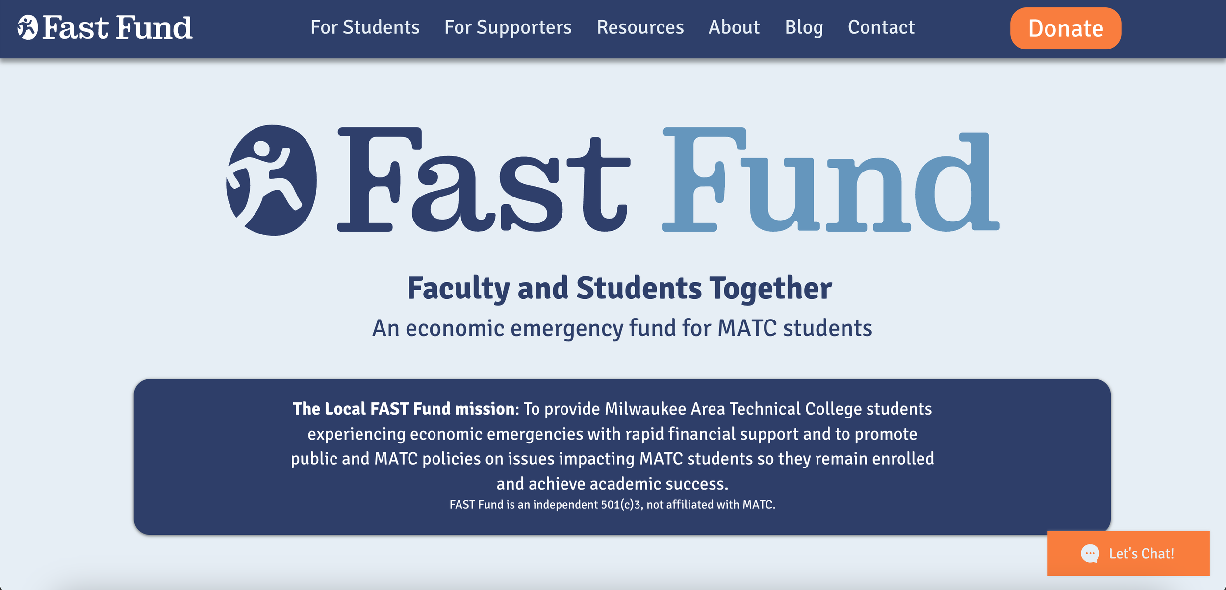
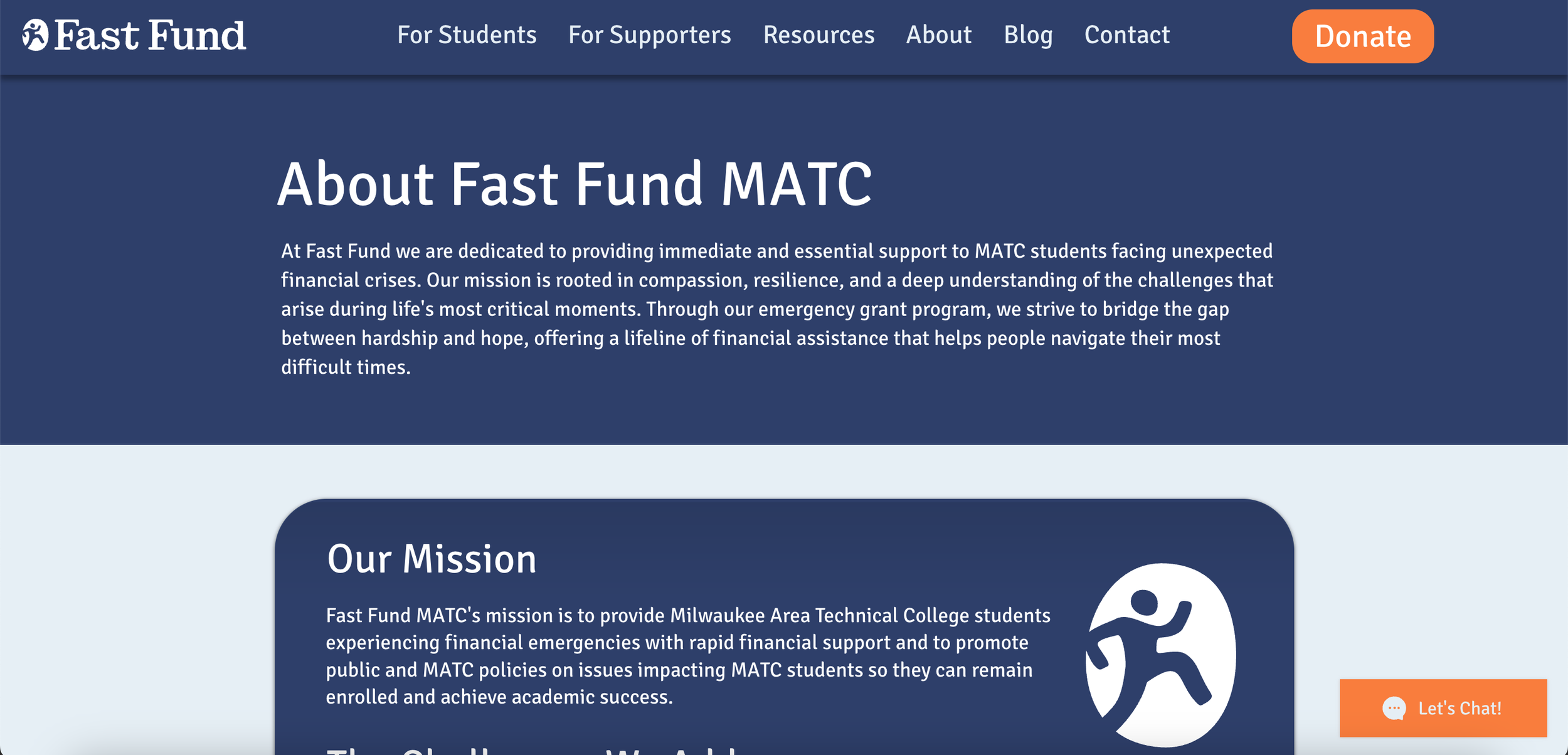
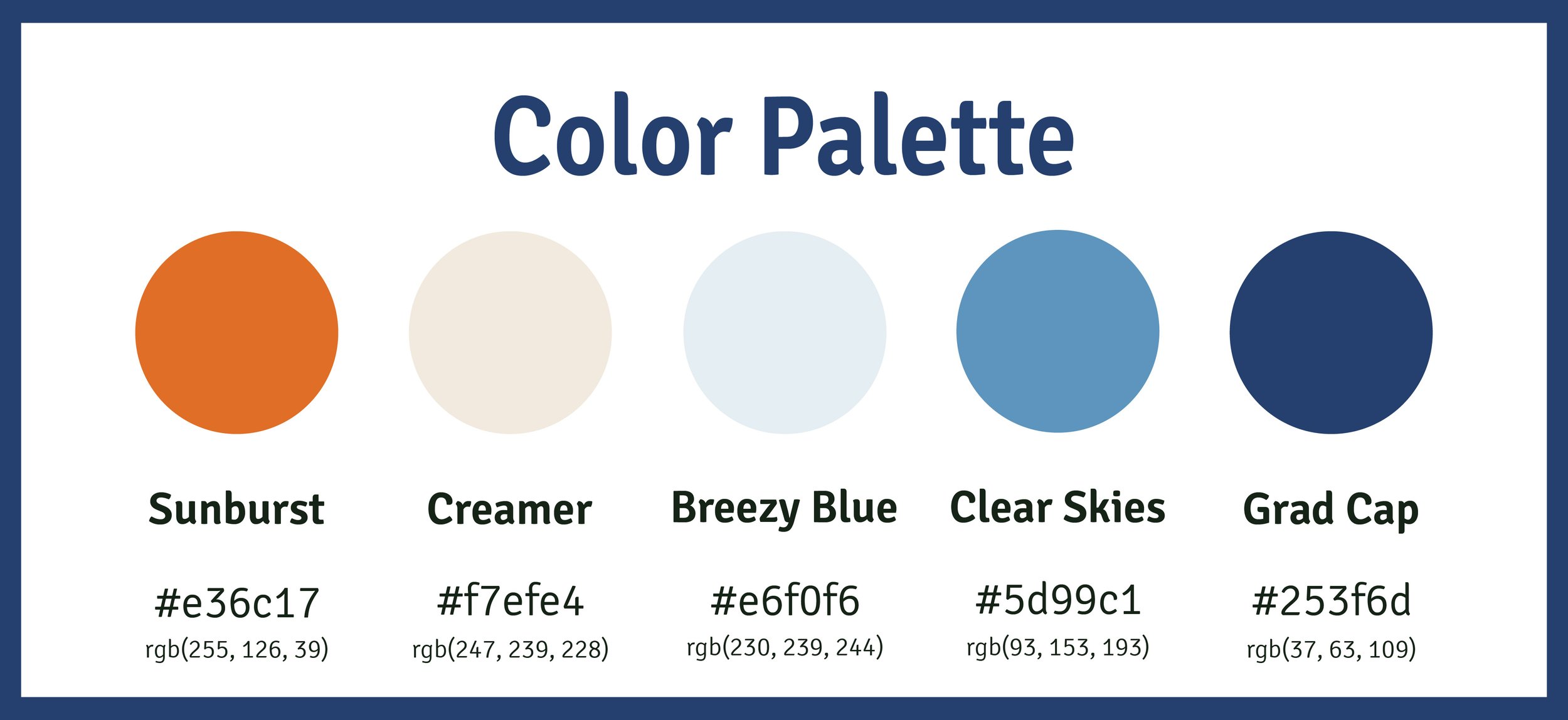
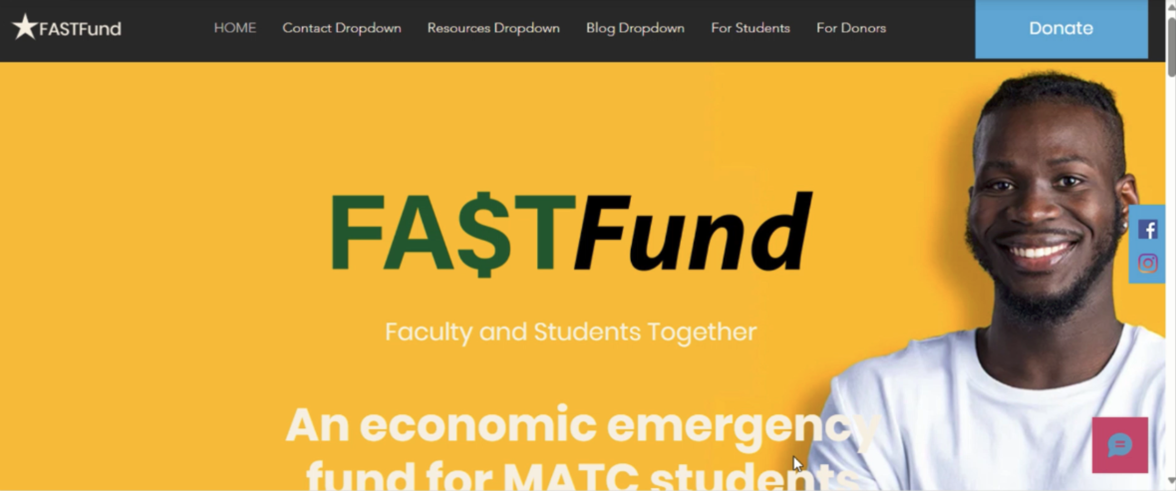
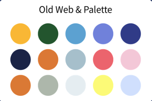
Fast Fund at MATC was struggling in a few areas. This included branding consistency, messaging, web content layout, and a lack of brand guide. We shifted the logo to seem more money-centric, almost like a cash checking service, to a people-centered message. This helps further the connection Fast Fund has with students instead of the money itself. The prior defined color palette was a bit complex and not used consistently on web and print, adding extra colors in, so we created a new color palette that is diverse, bold, and accessible. This was done in a matter of five months with the rebrand itself being about a month long, a quick turnaround. We developed a comprehensive brand guide with rules, guides, and instructions on maintaining the website, the visuals, and the brand itself. This helps with consistency and brand recognizability.
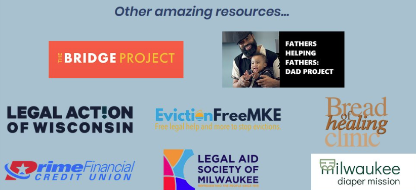
We increased the accessibility score of the website, ensuring more users could easily navigate the site. We included graphics and new pages to ensure language barriers were easier to overcome. We reorganized content from static pages, to dropdowns to find the information you are looking for quickly and easily. We applied the rebrand to the site, making consistent visuals between pages and from within the brand guide.
Before


After