BelAir Cantina - Mock
Rebranding of BelAir Cantina. A mock project to display a shift in archetype.
Role: Designer, Developer, Web UI/UX

The Process


The Explorer
in this project, I was tasked with shifting the BelAir Cantina brand from the Jester archetype to the Explorer. This meant taking BelAir’s quips, stylizations, and craziness and turning it to classy, bold, and adventurous.
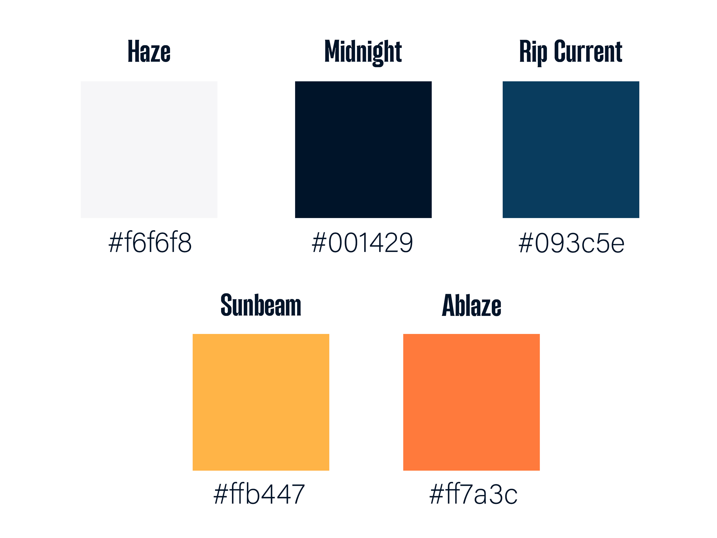
Until now, BelAir derived it’s boldness from it’s chaos. In this rebrand, it’s derived from the visual language of bold and sharp typefaces, strong positioning and posing, and powerful, vibrant colors.
Make It Bold

Where the boldness used to be derived from wit and chaos, it is now sources from the sophistication and strength in the colors, brandmark, and typefaces. This shift communicates daring travel as food is inspired by locations all over the world. It symbolizes bringing the adventure back home to the community it was found in. The customer themself becomes the explorer as they take part in the findings of BelAir Cantina’s chefs.
The Logo
The typeface for this new direction is one that stands strong, but maintains the quirkiness of BelAir Cantina.
The simple silhouette shows shapes that lean into the spice of the food, but also the waves in California (and lake Michigan!).
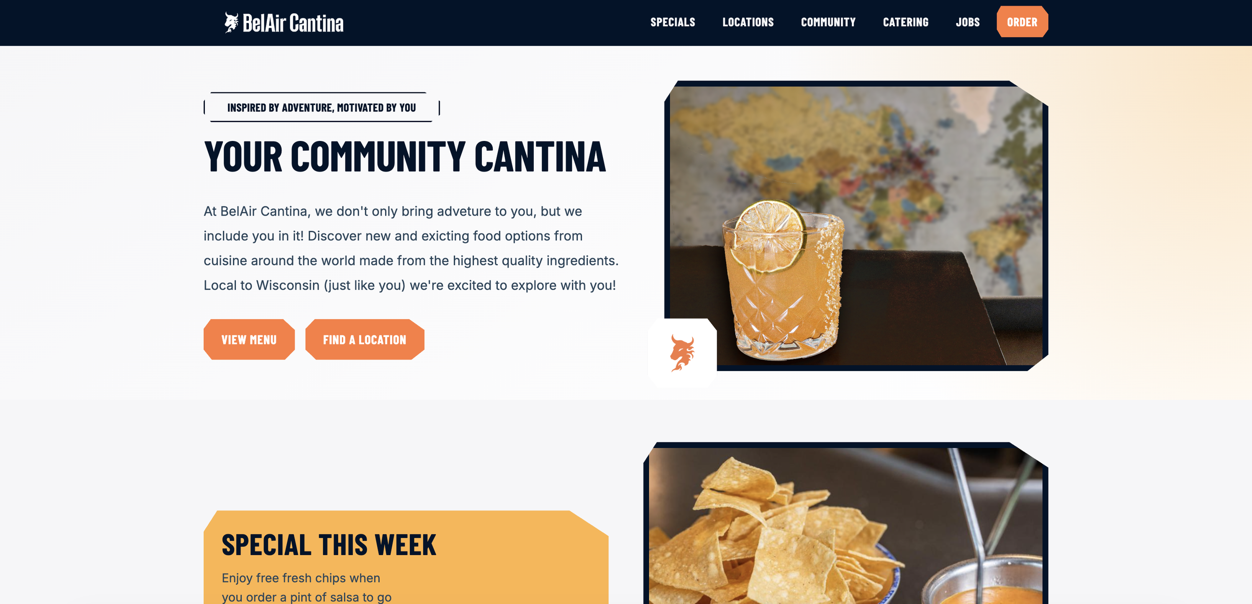
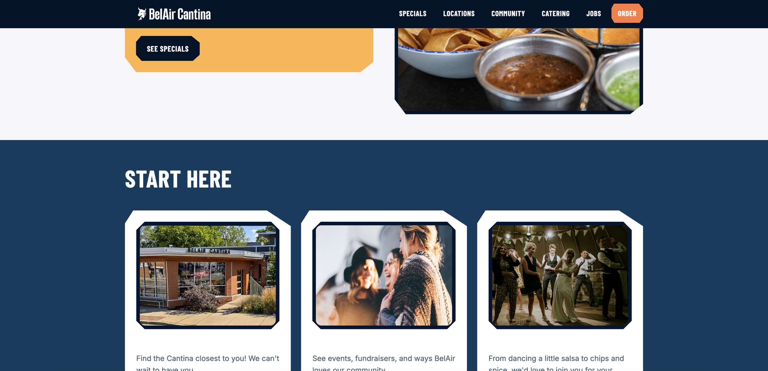
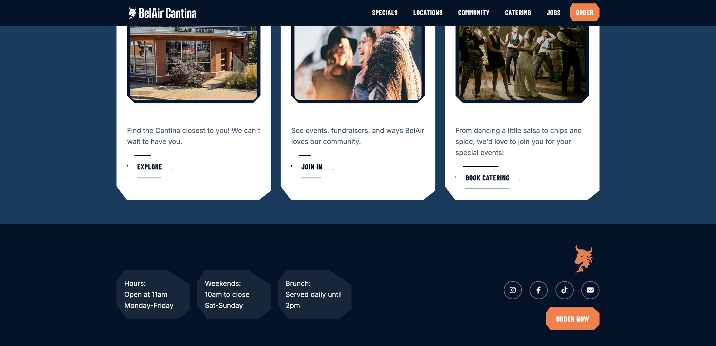
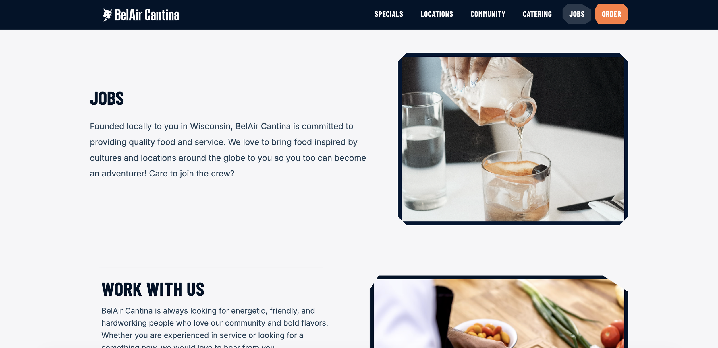
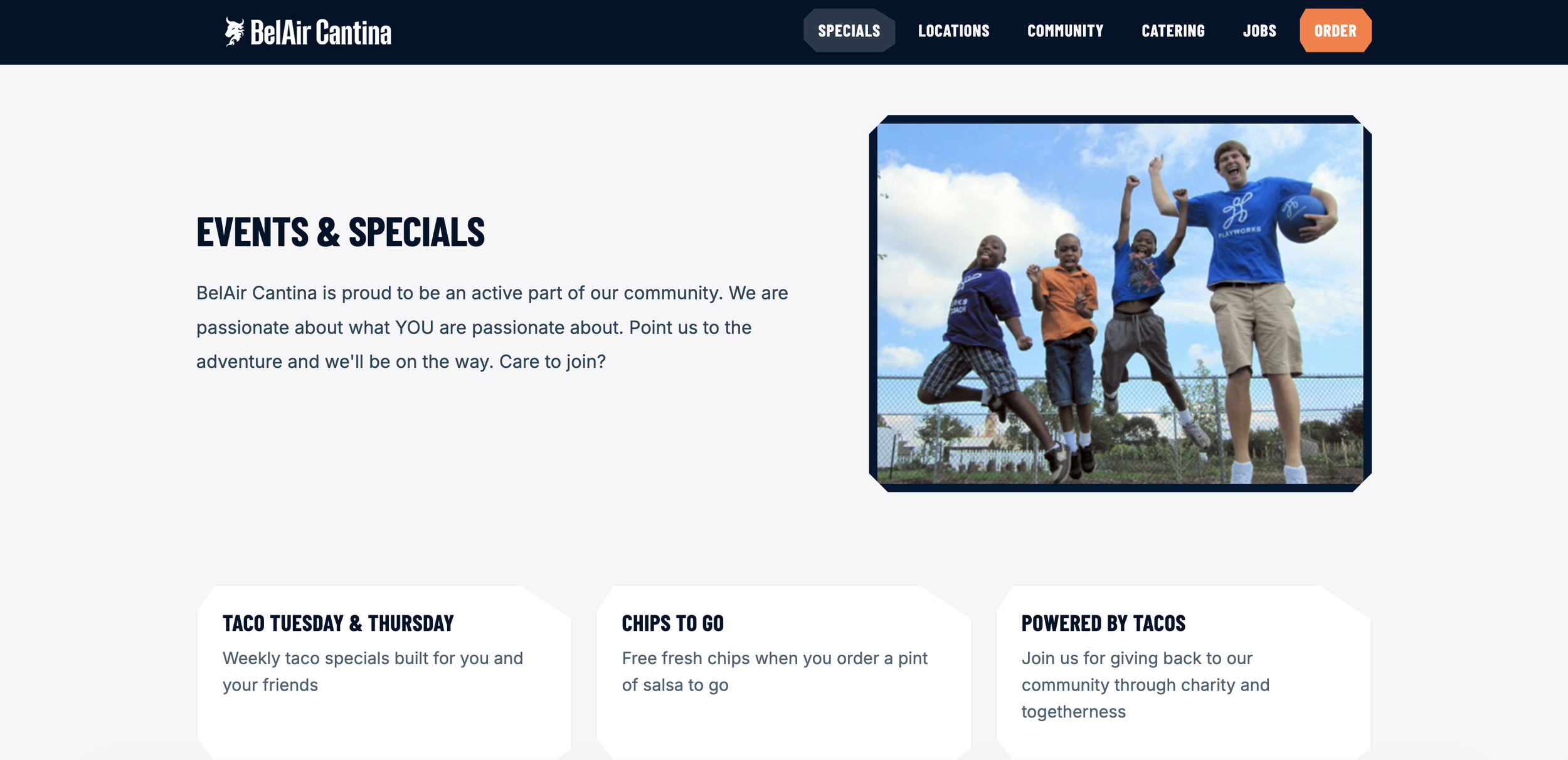
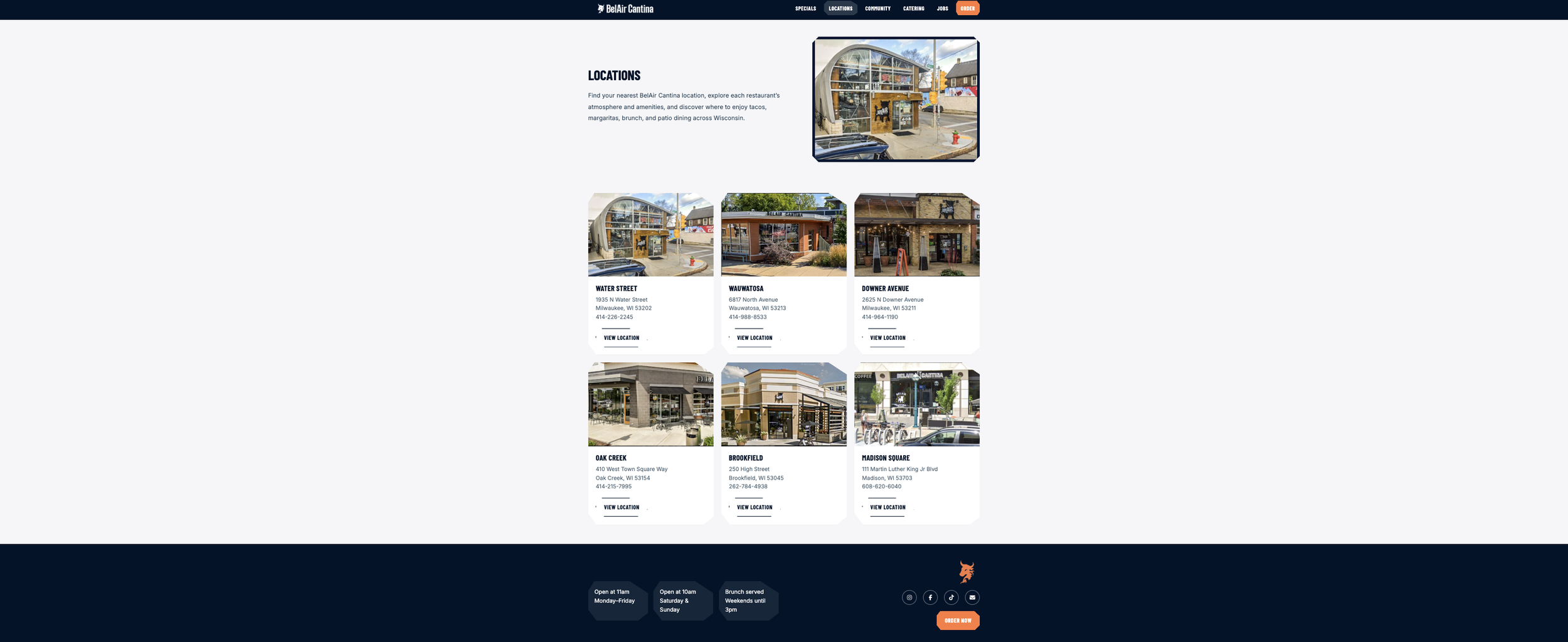
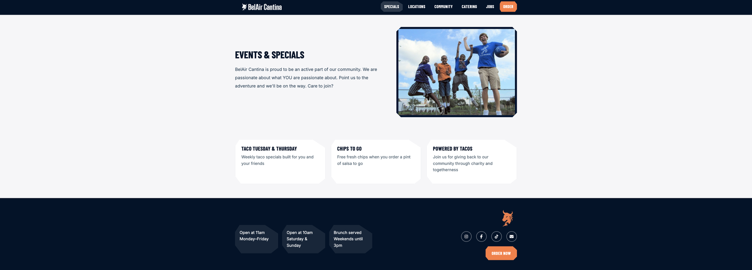
The Website
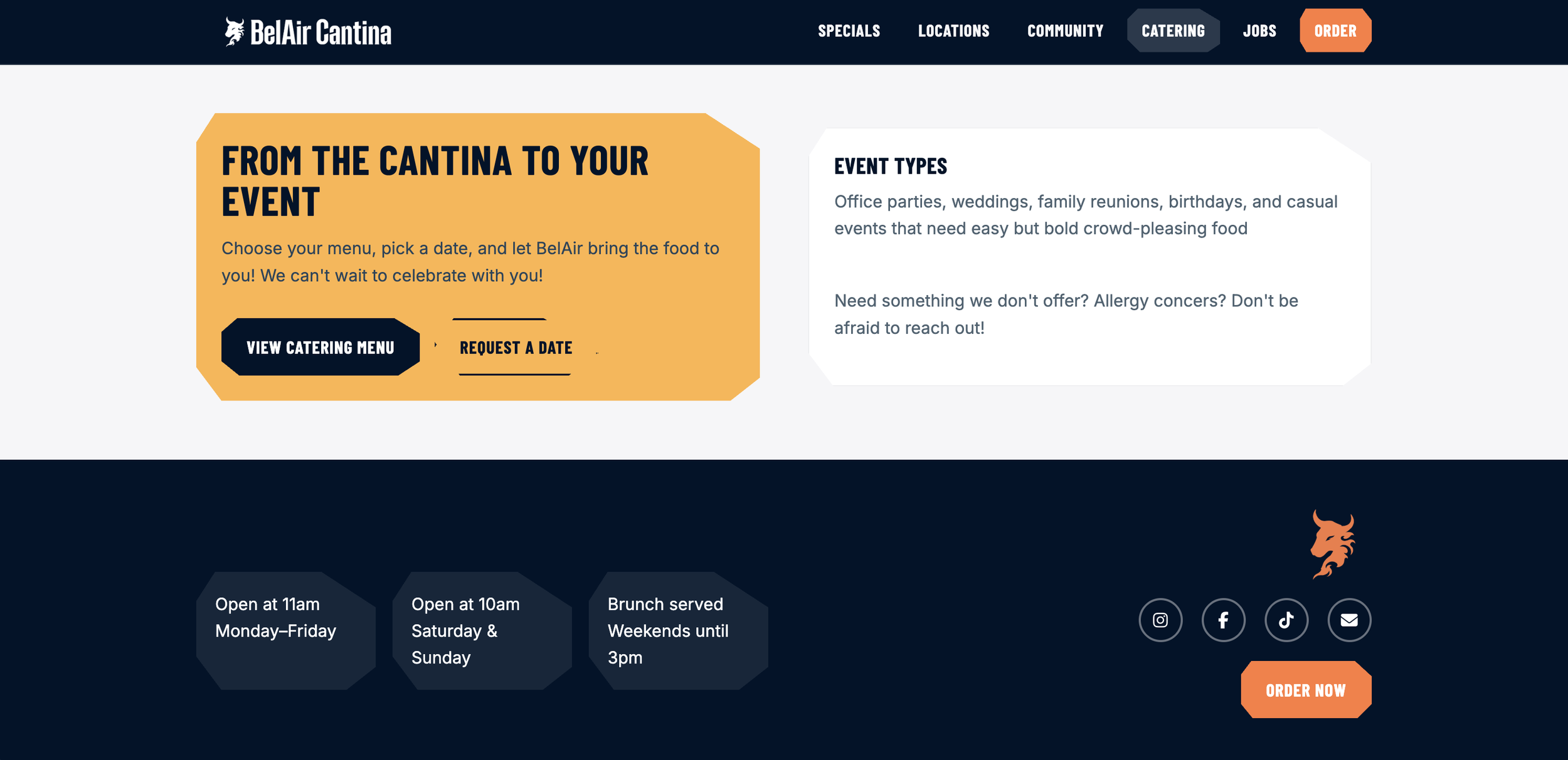
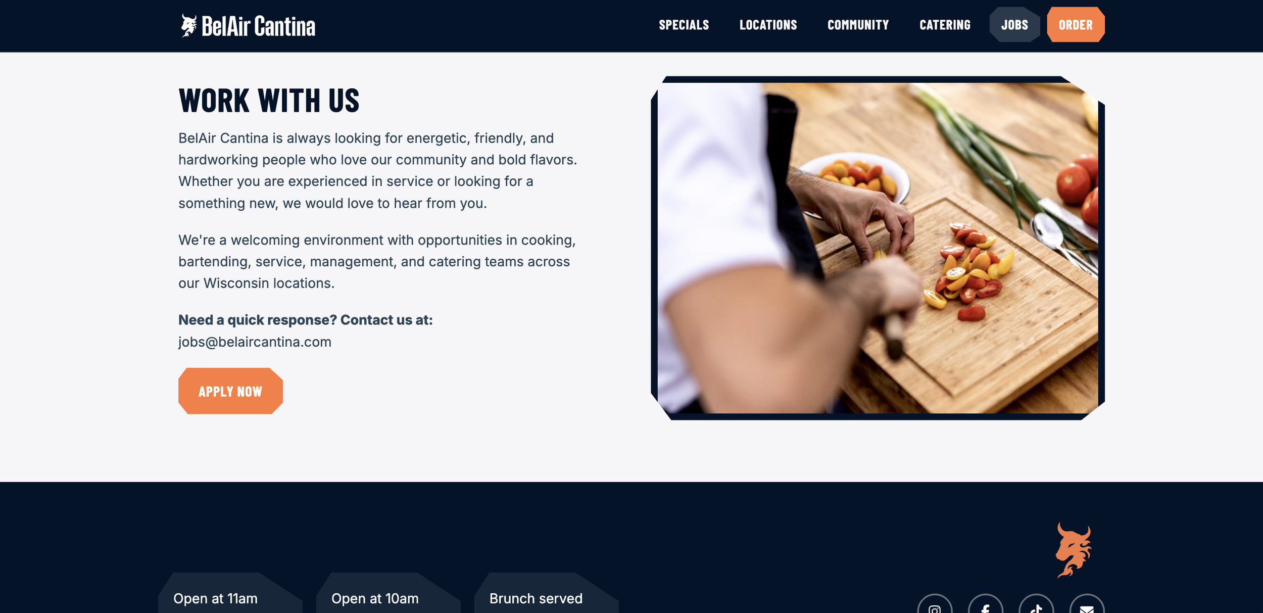
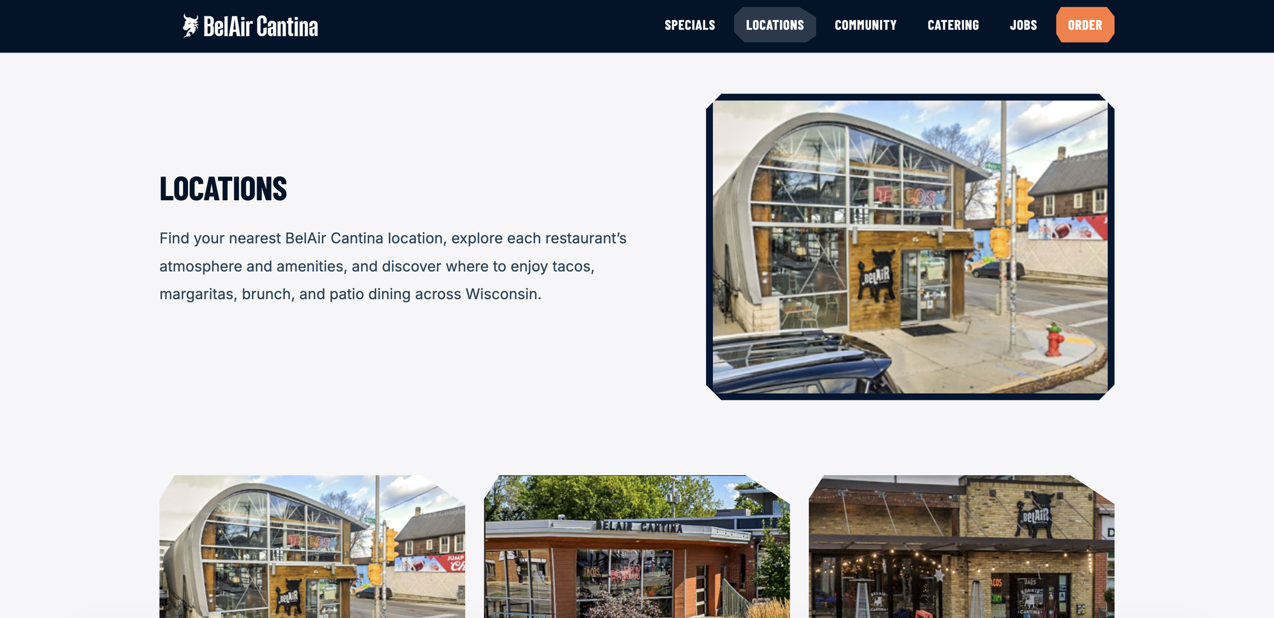
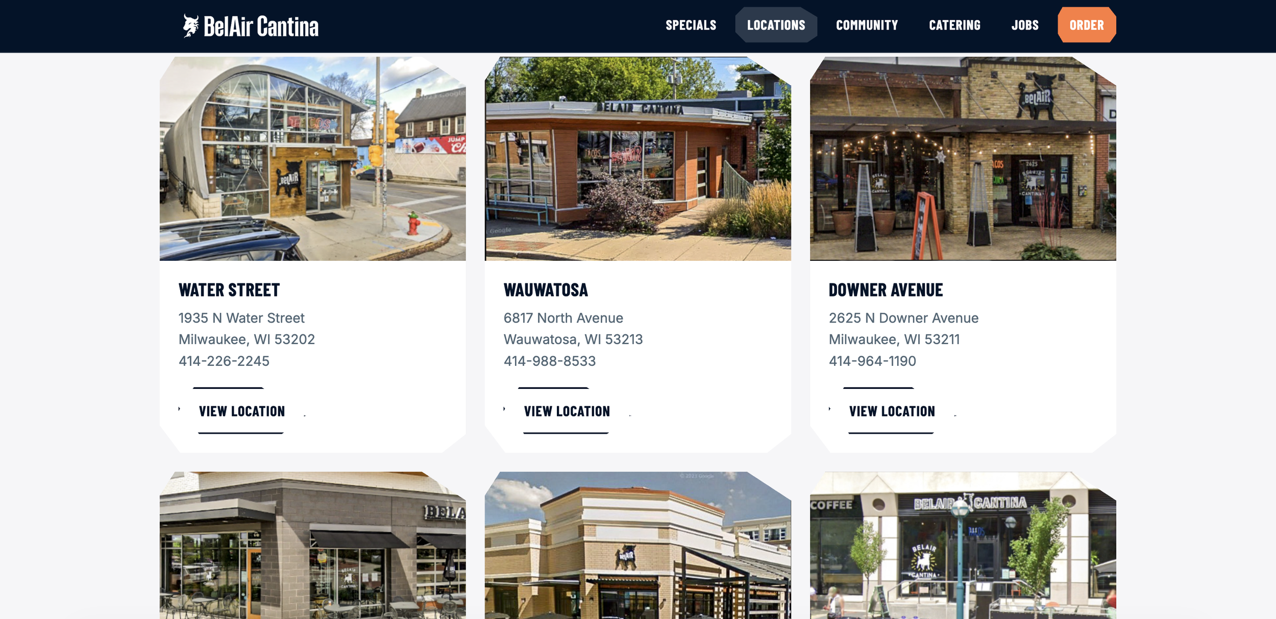
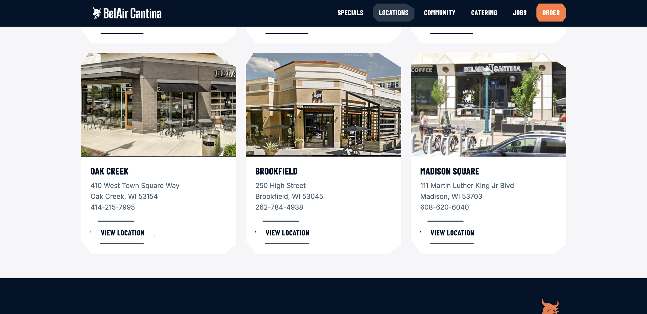
Bold and Proud
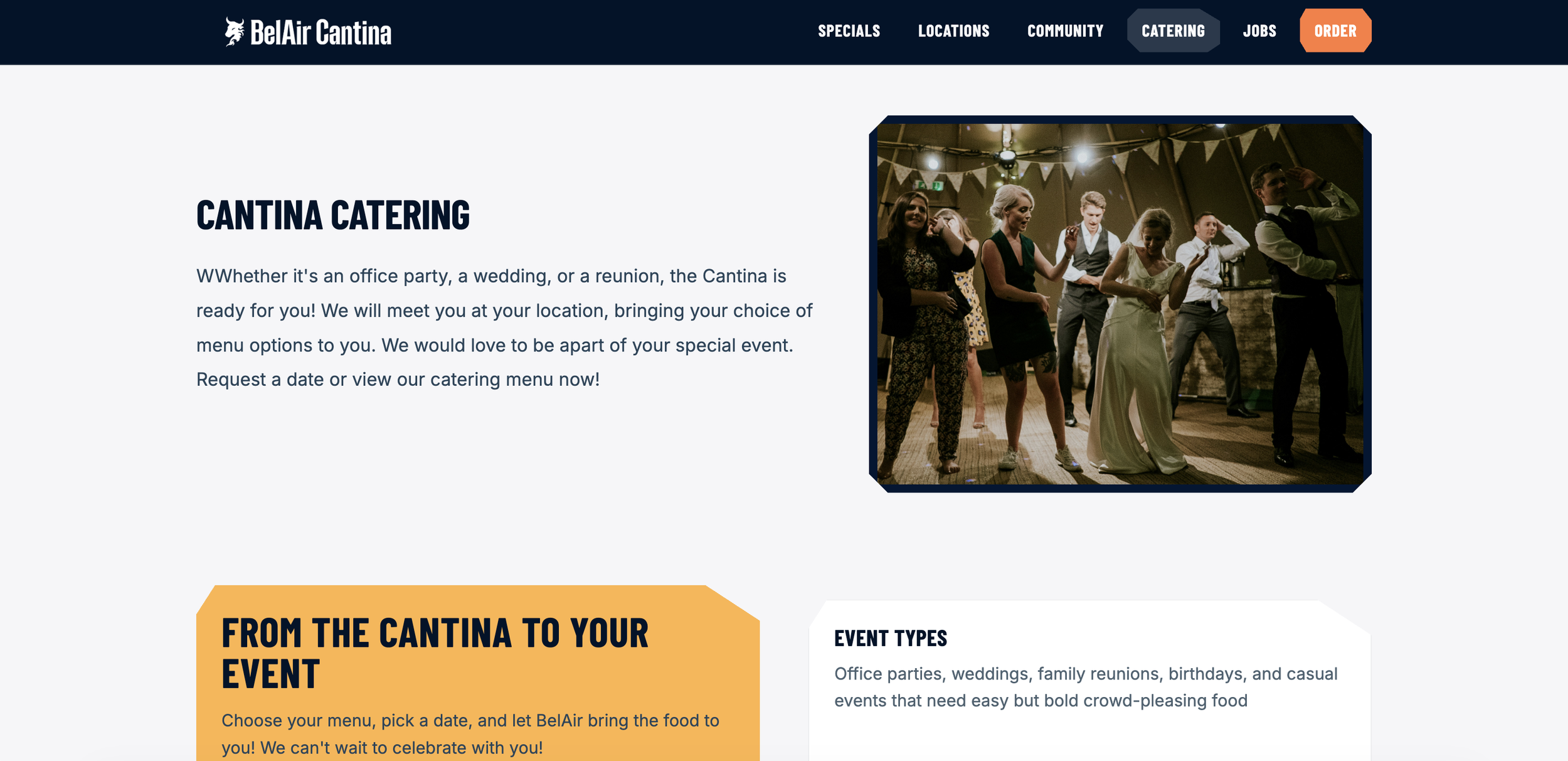
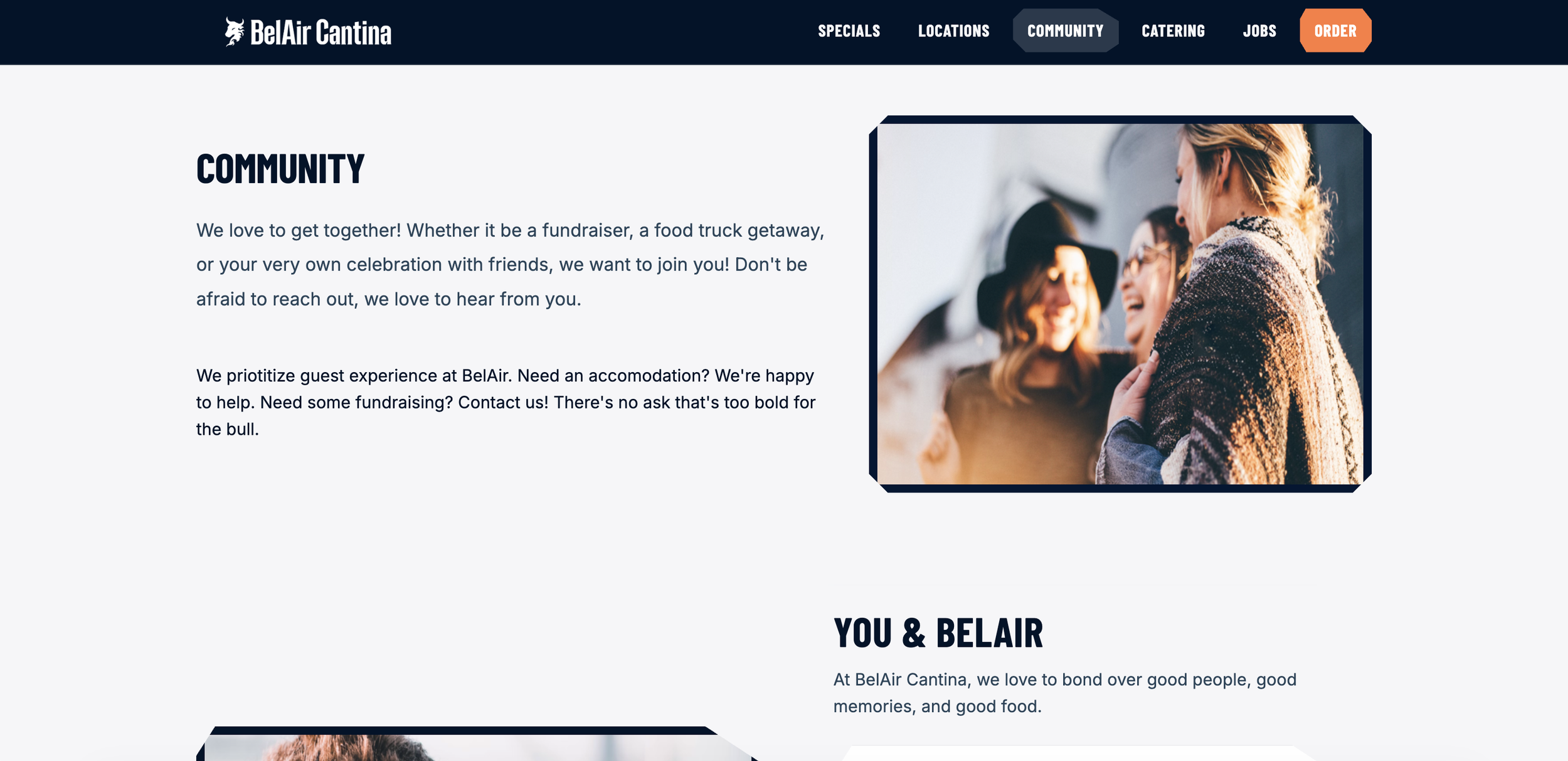
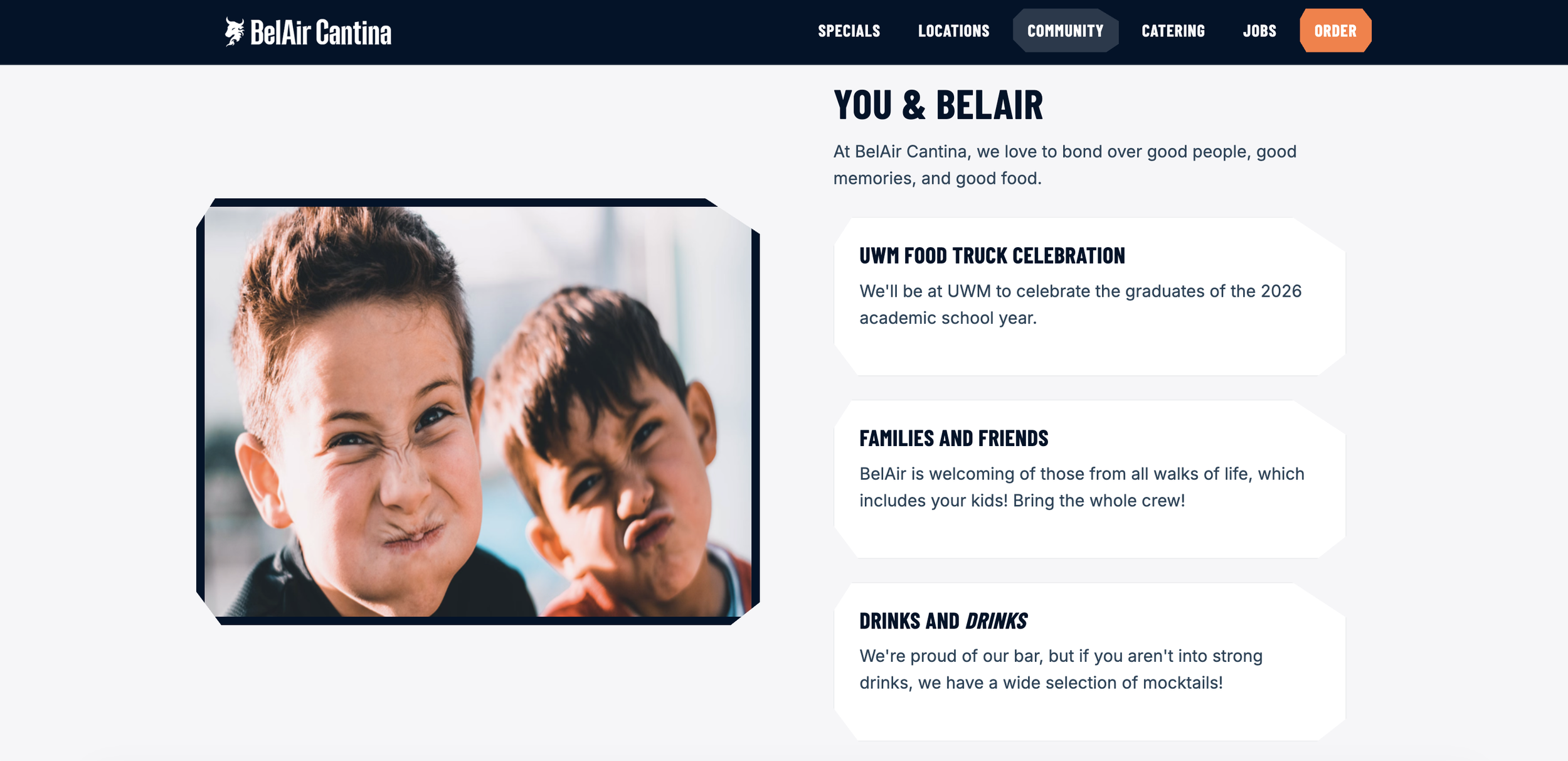
A simple layout that communicates boldness, but community. It’s approachable, welcoming, and there to get you the food you love.
The borders mirror the geometry of the word mark. Colors are placed thoughtfully to prioritize hierarchy and the boldness BelAir strives for. Photos show what’s most important: the community.
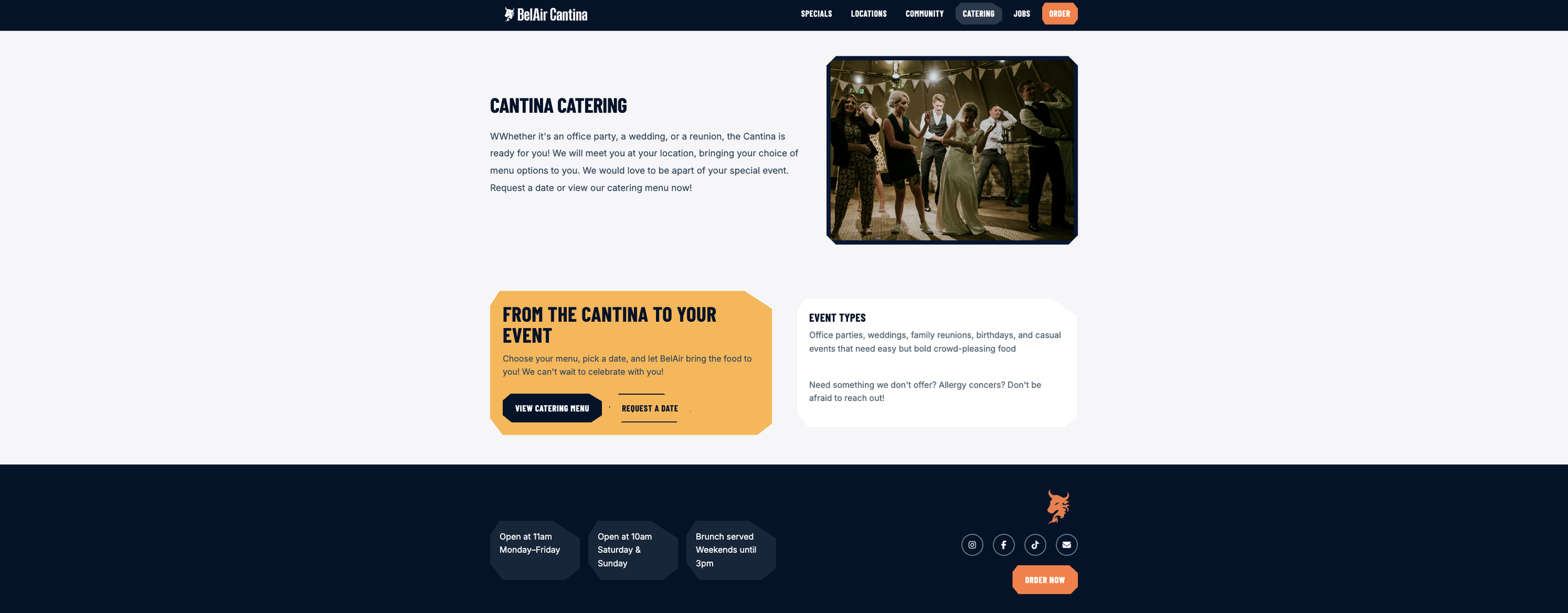
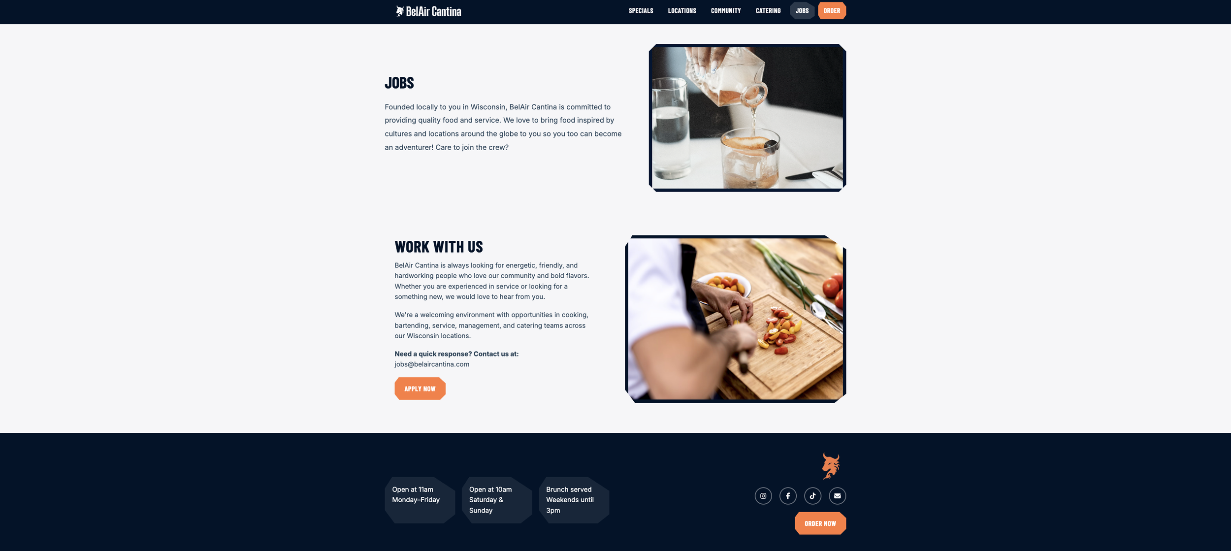


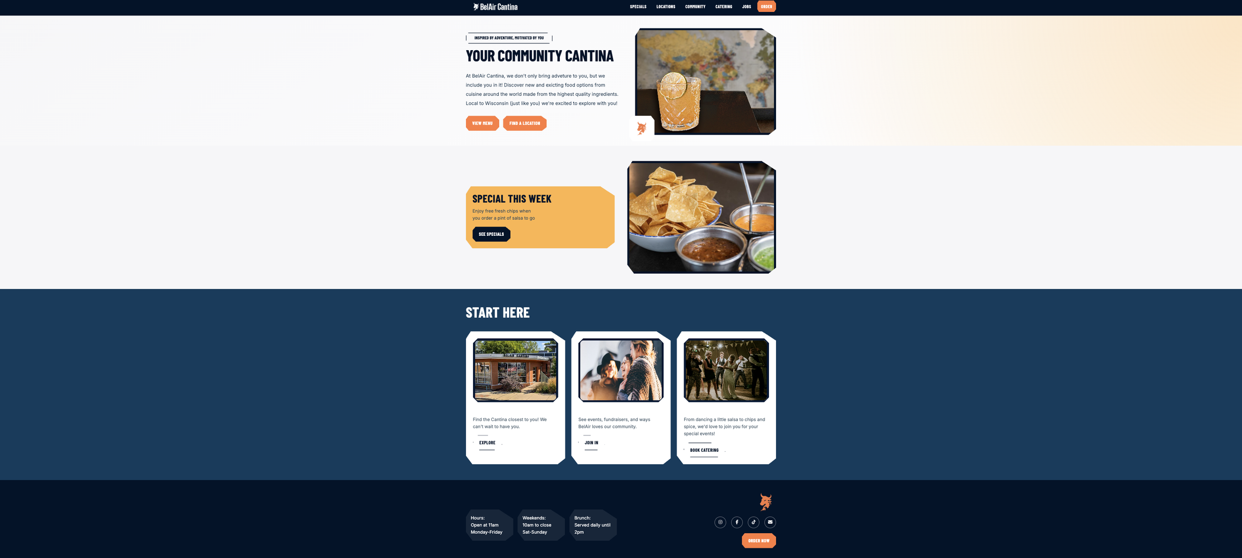
Prioritizing the community, boldness, and good food.