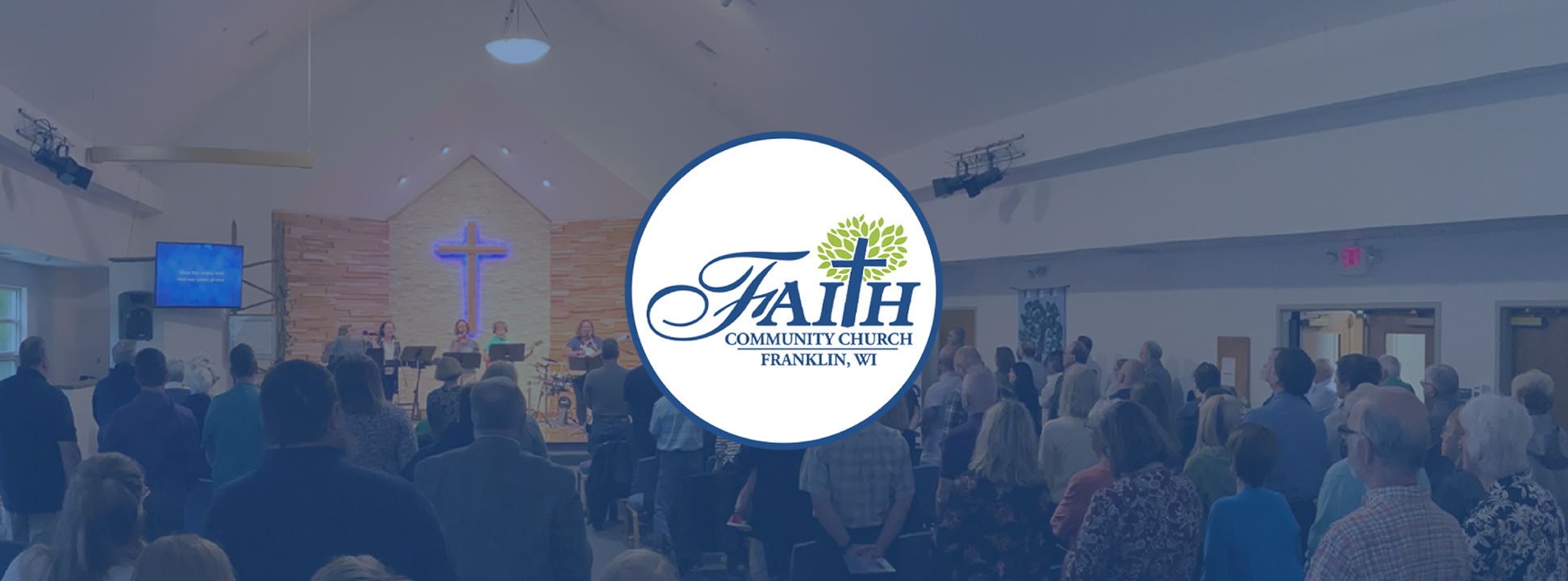
Faith Community Church
I gave Faith Community a brand refresh along with modernization to the website. This helped improve what the church strives to have - stronger connection.
Role: Designer, Web UI/UX, Video Editor, Communications Specialist
The Process


Freshening Up
Faith Community Church is a pillar of the Franklin community. They act as a point of connection for people looking for relationship, charities & food banks, resources, and more.
Faith Community had a strong foundation and just needed a refresh!
The original website was difficult to navigate and the way branding was used didn’t communicate who Faith Community is to the strongest extent.
Utilizing what Faith Community already had in their pocket, I added onto their assets for a broader library, modernized web presence, created new print materials/templates, and helped strengthen the brand voice through a refreshed visual identity.
Asset Rennovation
Strengthening the Set
I began with basic refreshing to the core assets. This began with proper organization and file naming structures. I took what assets didn’t have color variations (black and white, etc) and assigned those to them. I also seperated the tree from the full logo for a brandmark and favicon.
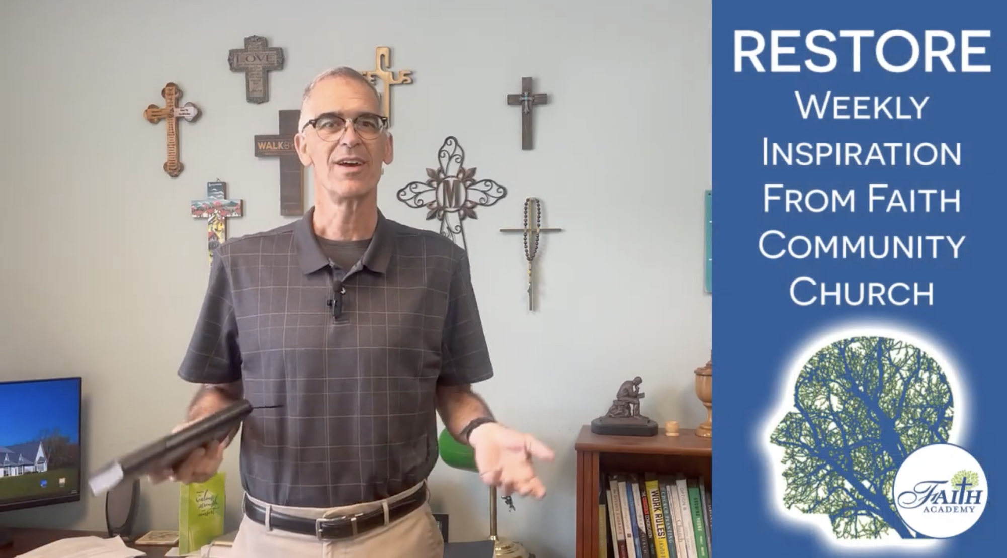
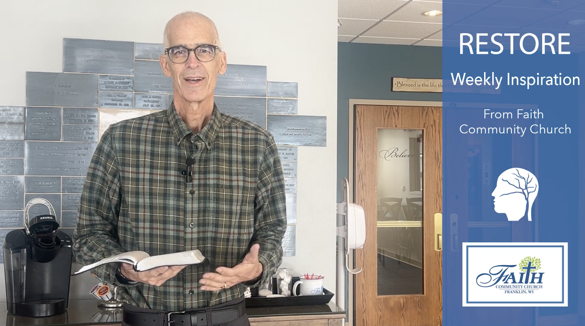
I refreshed core parts of Faith Community’s identity, including the website, print materials, and the RESTORE series before we moved onto Gospel VOIP.
Overall, I wanted to modernize the visual identity while keeping what makes it special to those in the community,
A New Feel
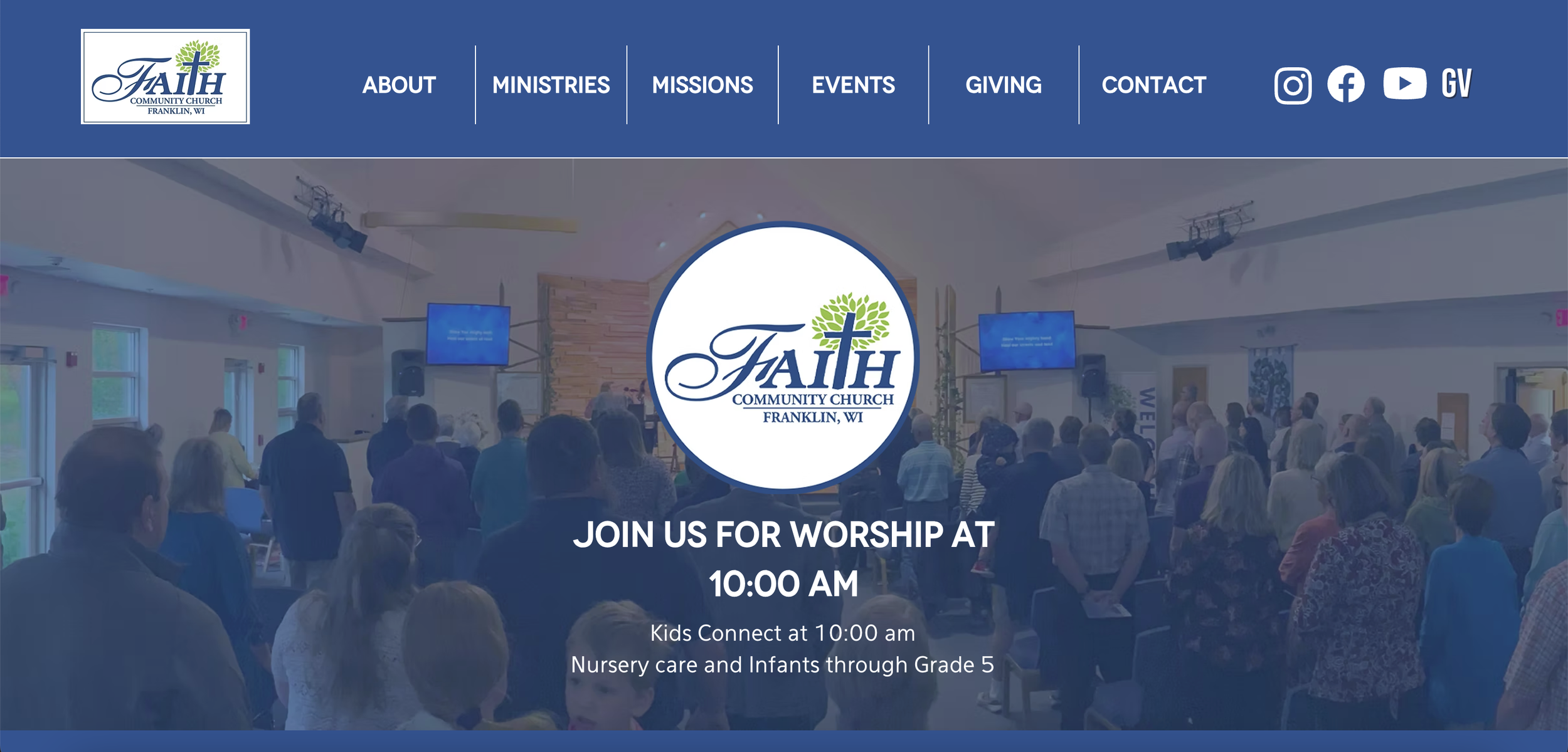
The website had not been visually updated in many years, as well as the information in the website. Modernization allowed for easier navigation for those involved in the church, community, and those who rely on having correct and easily accessed information.
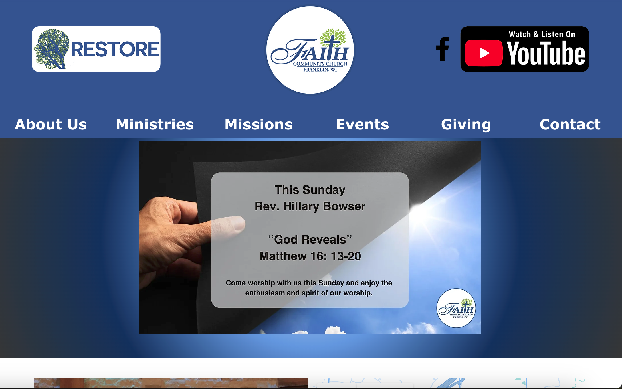
The Old Website


A Fresh Look:
Website Update

Come Alive


Improving the website began with simplification and organization. Information was refined, condensed, and updated. I updated the visuals, such as the banners, with the refreshed visual identity. I updated the fonts to match those in the style guide and refined where they were each used depending on their purposes.
I updated the photos to be high quality and copywrite free. I created a new banner for the home page and refined the visual hierarchy. I updated the main navigation and footer to be more current with logos, icons, and user habits.
Overall, I modernized the website to be more aesthetically pleasing to the web 2.0 user, more organized and refined to the community members, and to speak a more clear message to anyone coming across the website.
A Better Connection
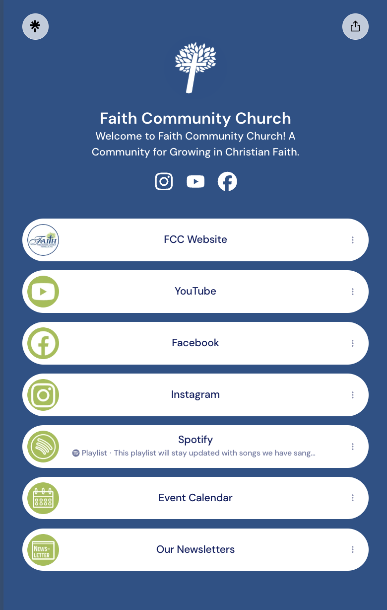
I created a Linktree with an accompanying QR code to add to print materials to condense information from multiple QRs/web addresses to allow room for other visual elements.
Hot off the Press

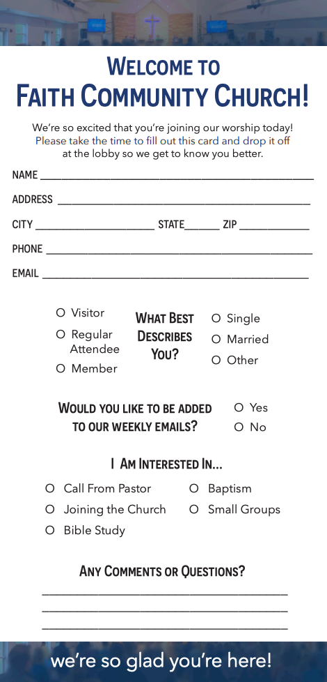
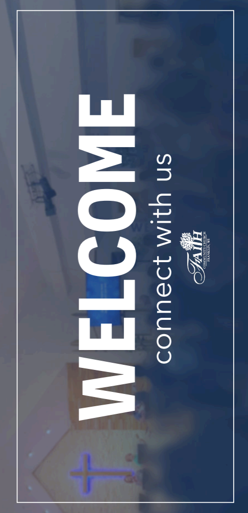
Welcome Card
The welcome card lets the church connect with it’s members, first time guests, and the community.
The front of the card is a simple call to action with an image of Sunday worship in the background.
The back of the card allows the person to answer questions about themselves and what they are looking for. It’s a simple and effective card that allows for closer relationships.