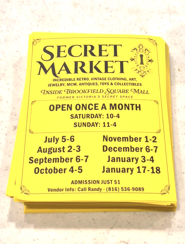
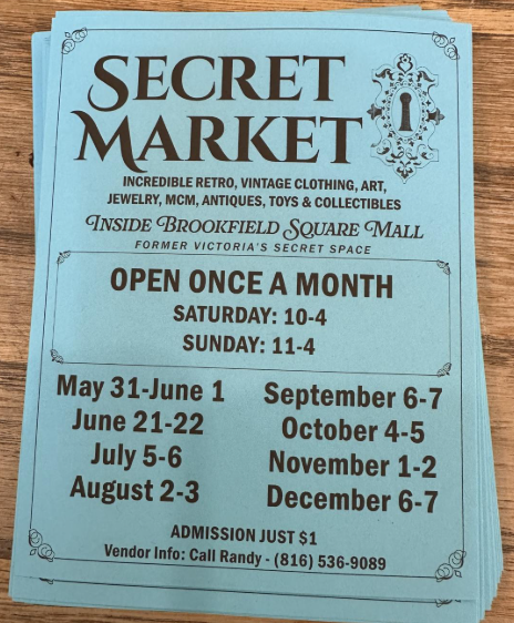
Secret Market
An antique flea market where your eye determines what the market’s real secret is.
Role: Designer
The Process
Makin’ it Mystical
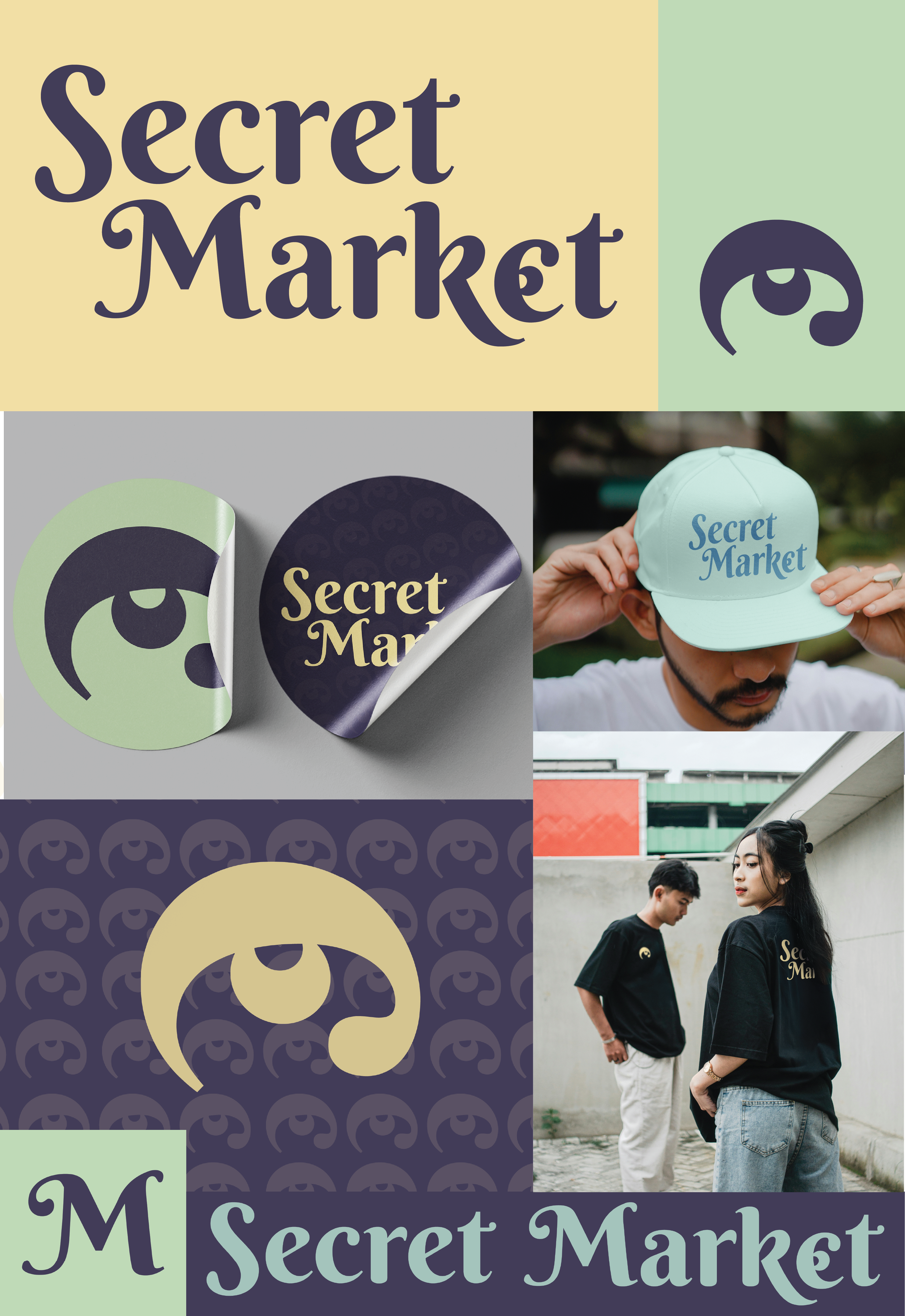
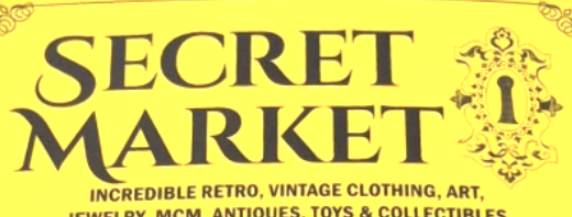
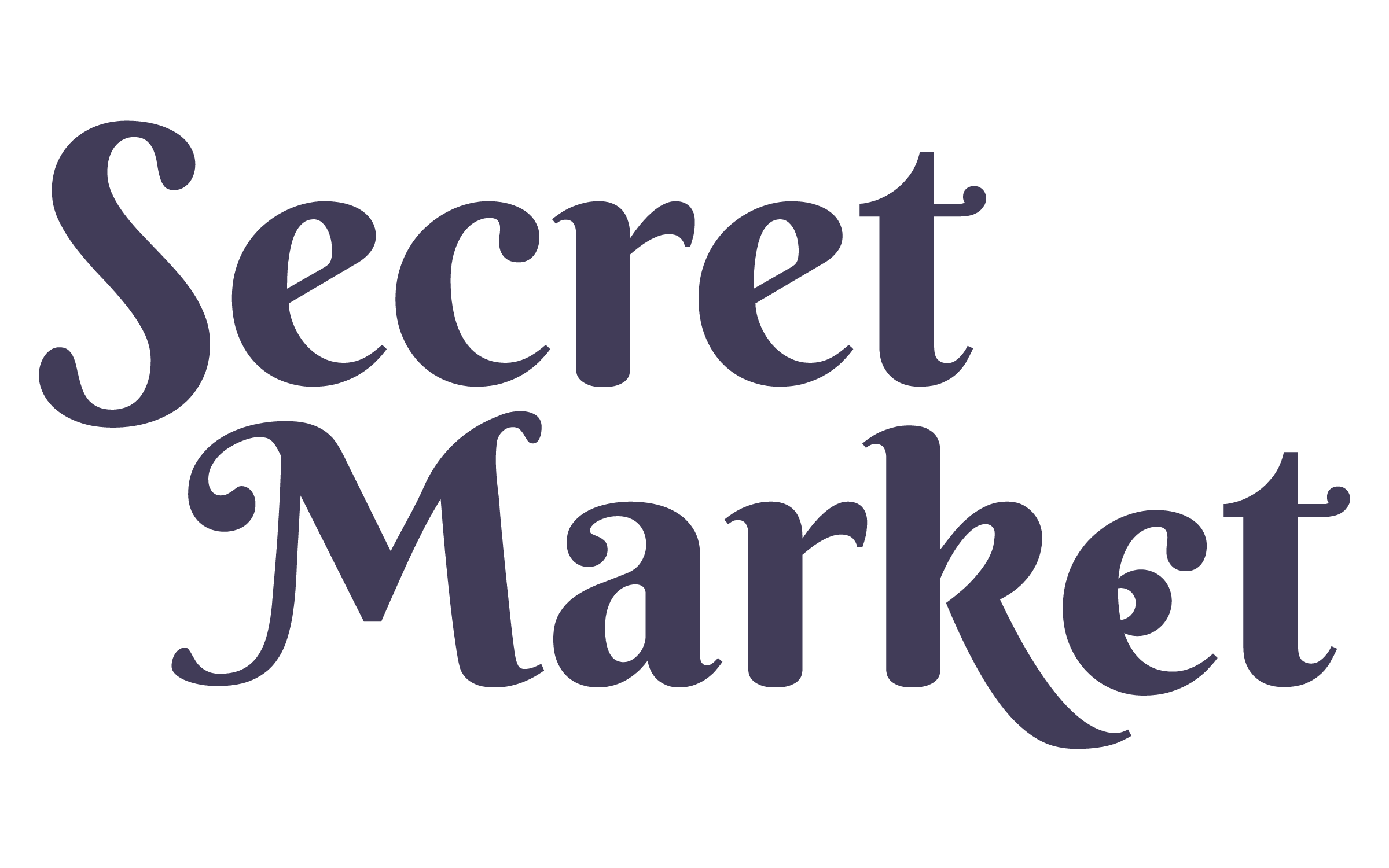
The Secret Market began with a visually complex wordmark. The typeface overwhelmed the eye with the intricate brandmark having no instances of simplification. The logo communicated “antique market”.
But, the Secret Market is supposed to be about YOU. What your eye sees as special, unique, and the “secret” to what makes the market what it is.
To communicate the whimsy and uniqueness of the market, I chose a typeface with quirky curves and serif designs. I hid an eyeball in the “e”…as a secret for those who wish to find it. This communicates that what really makes the market different is your own eye! Not just the antiques you may find, but the community you’ll build.
The Original Brand
Not Just a Logo
Rebranding the Secret Market wasn’t just for a refresh of the logo, but to build a visual identity.
Fresh!