Fast Fund at Matc
Rebranding of a nonprofit website to shift from transactions and cash to student-centered communication.
Role: Designer & Web UI/UX
Timeline: January - April 2025

The Process

A Reimagining
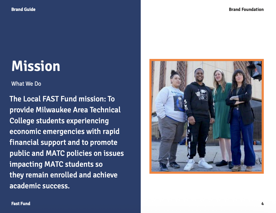
Fast Fund’s goal is connect students with grants, resources, and communities that can help support them through completing their education. It’s about supporting the person, not the funds them.
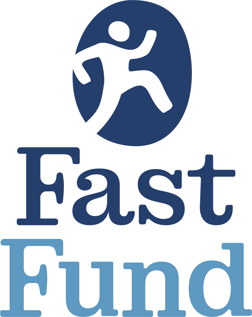
To create a welcoming and people-centered feeling to the brand, the money iconography was removed and replaced with that of people. In the logo, we showed a step toward success. Using the soft serif font, we conveyed academia & accessibility. The color scheme conveys calmness (as students are often in financial crisis) and boldness to succeed with our pop of orange. We reorganized the page and colors to be simple, accessible, and to communicate connection.
A Step to Success


Fast Fund partners with people from all walks of life. Students include those fresh out of high school, parents, part time students, those seeking certifications, those working full time, those who are low income, and more. Because of this, Fast Fund’s redesign needed to be calming and direct.
The brandmark shows a student taking a step toward success. It also communicates how the Fast Fund community will walk with students to get them where they need to be. Even if a student doesn’t qualify for assistance or has a need outside of bounds, Fast Fund will walk with people to connect them to someone who will help.
The typeface chosen was to communicate academia with the serifs, but maintain a modern and friendly appearance through its stylization and curvature. Students can be confident in the trustworthiness of it’s appearance and yet still feel connected to the nonprofit through the stylization and brandmark.
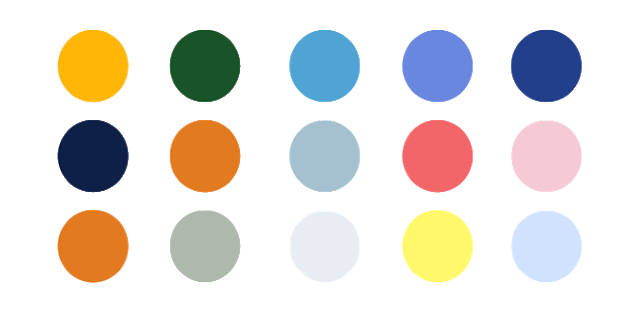
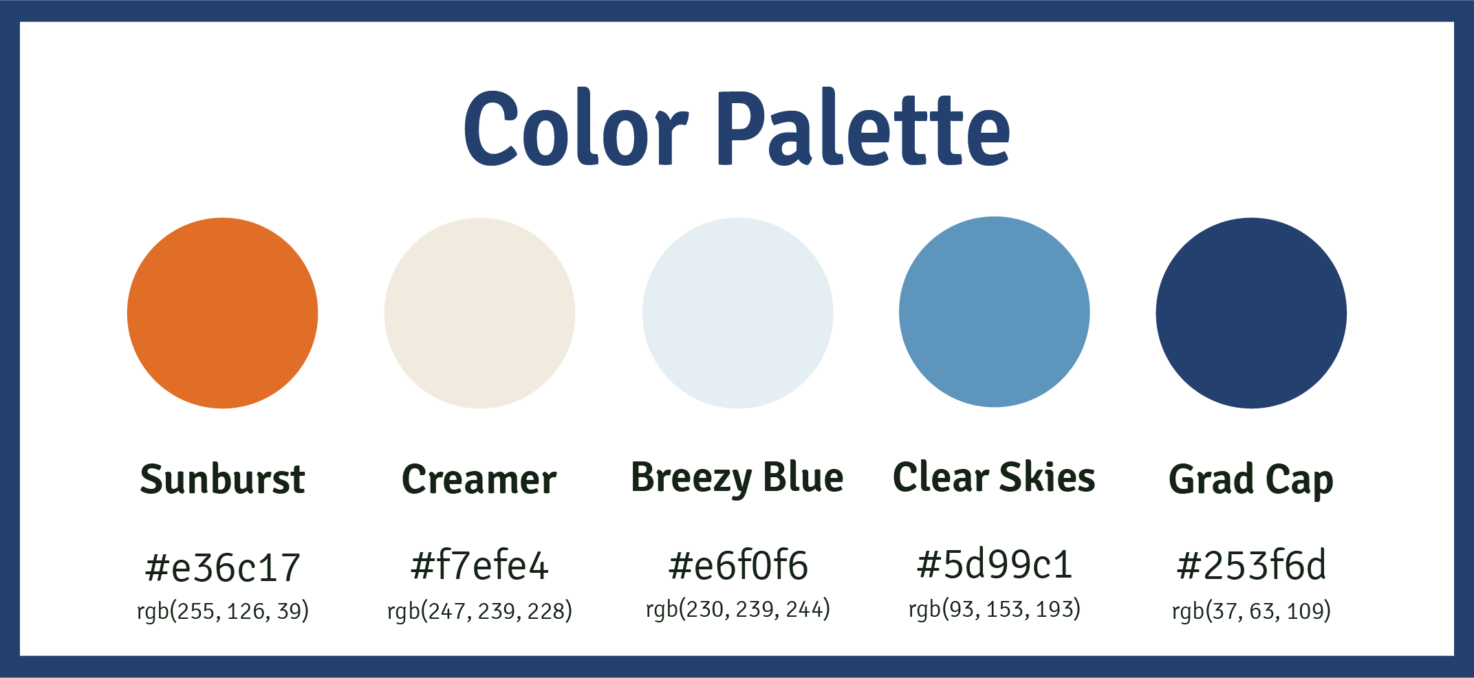
The color palette was chosen with blues to communicate serenity. Those reaching out to Fast Fund are often in a state of panic and need assistance quickly. We chose subtle and calm colors to relax the student. We added a bold orange, both as a pop of color and an indicator. If something is really important or crucial to students, the bright orange stands out and helps them navigate the site.
Fast Fund’s rebrand included a full brand book and visual identity package completed in full in only three months.
Navigation

Restructure, Reorganize.
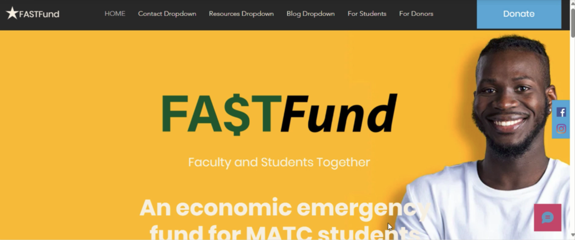
The main navigation started as static. This created long pages with no organization system. Students quickly navigating the site, those with difficulty using computers, and those with language barriers struggled to navigate the site.
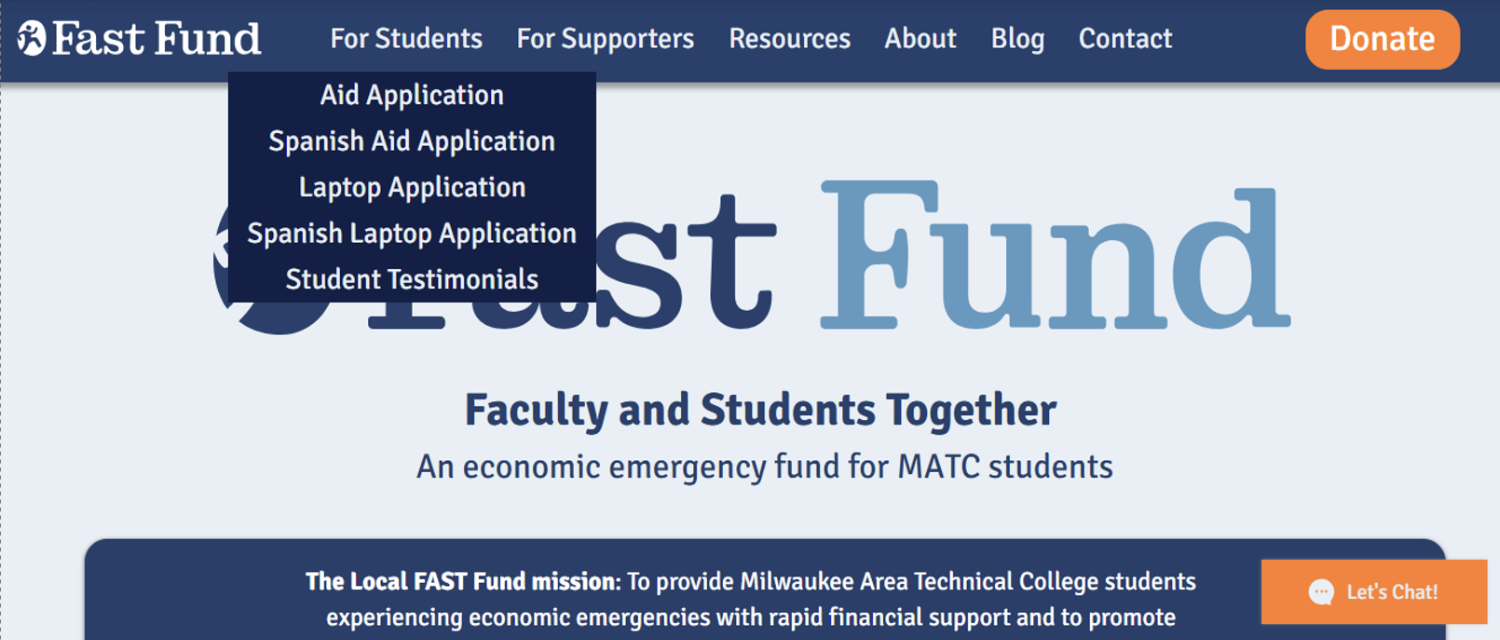
We took the core topics Fast Fund’s website could be organized into and created drop down menus. This way, students could easily find the information they were looking for. If more information is needed, they could search for it themselves without having to weed through long pages.
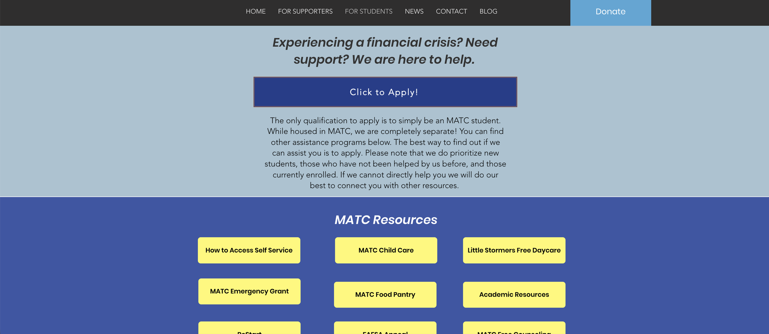
Original Site Layout Examples
Home Page (scrolled down)
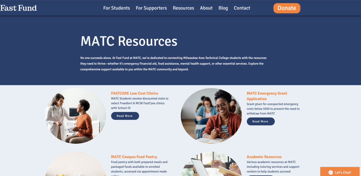
For Students
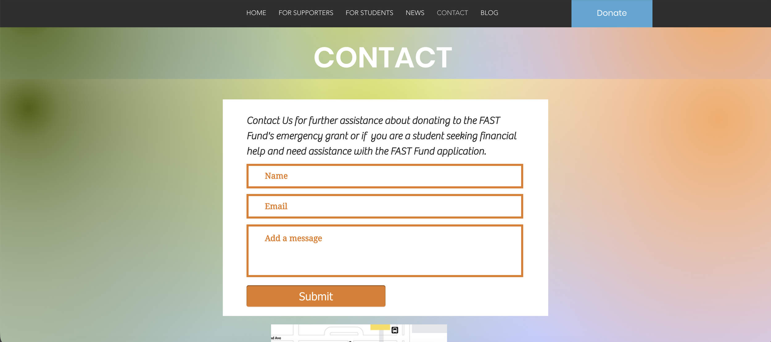
Contact
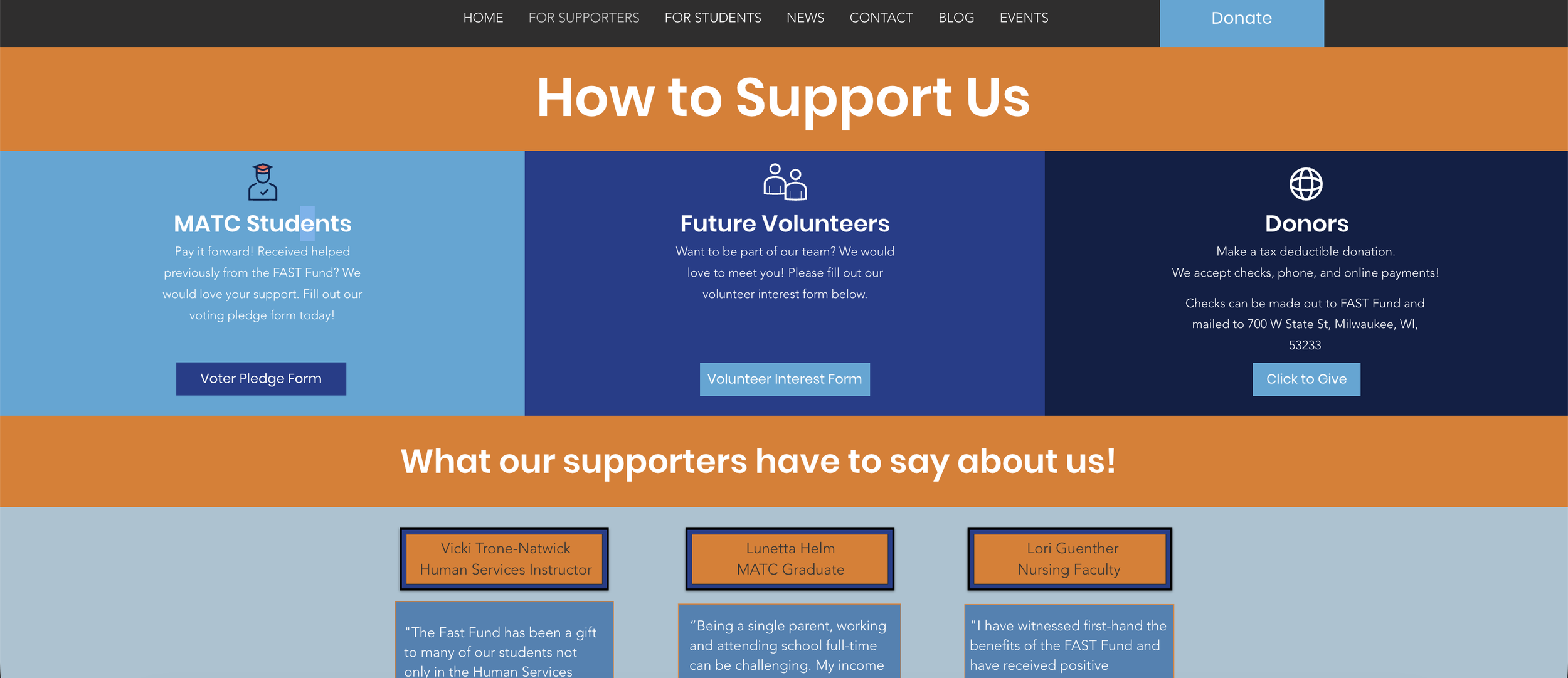
For Supporters
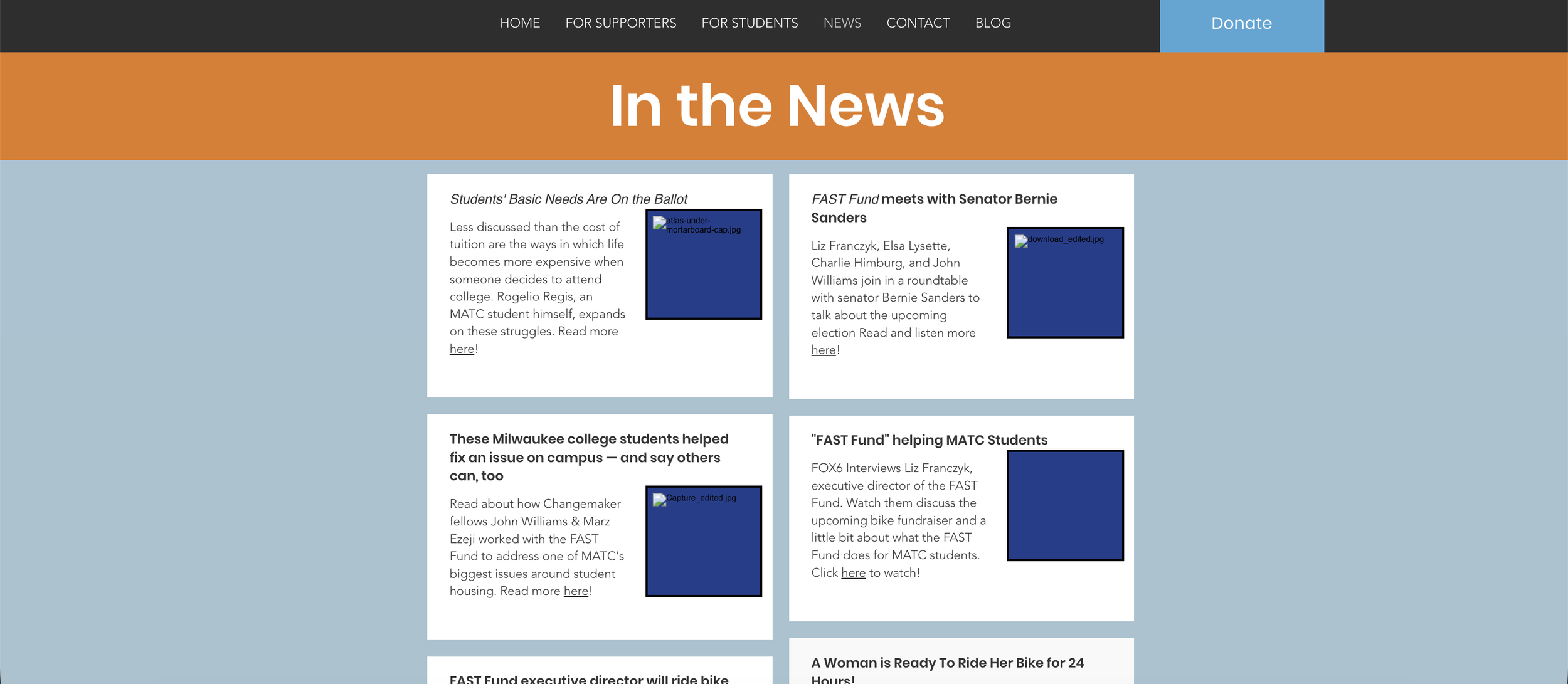
News
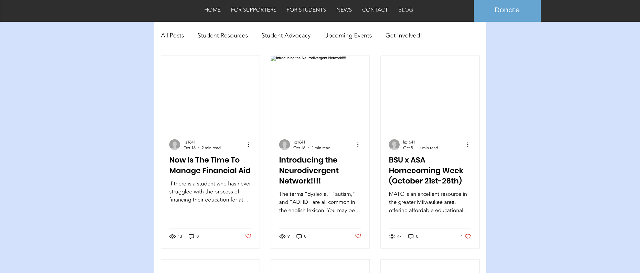
Blog
Reduce, Reuse, Redo.


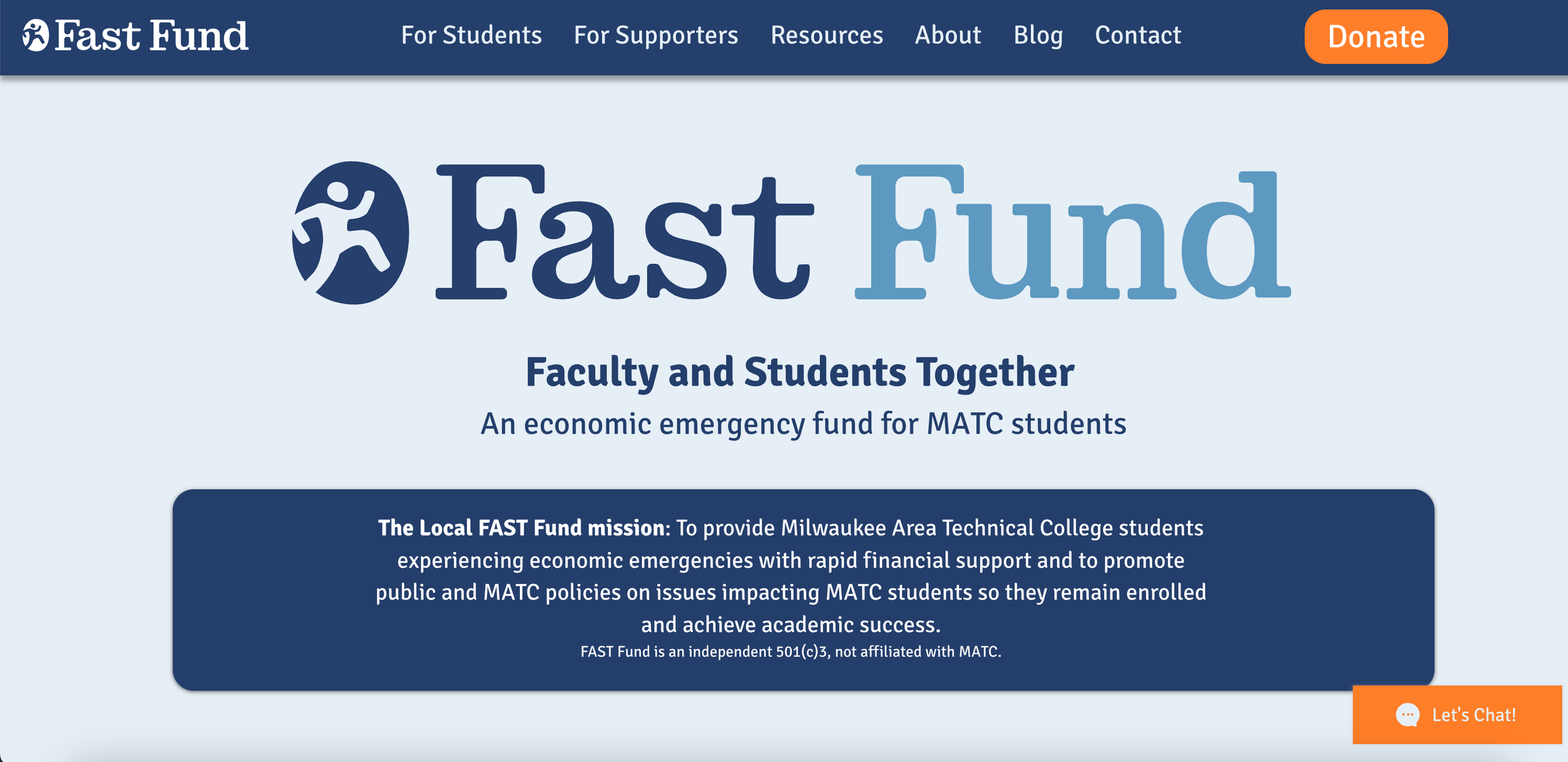
Home
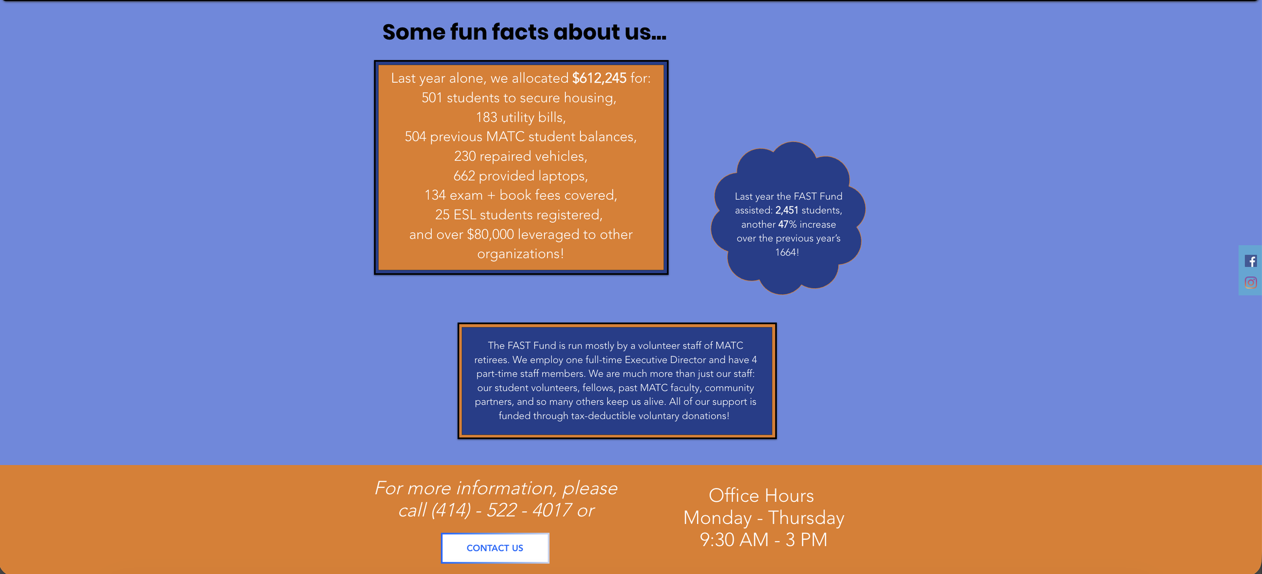
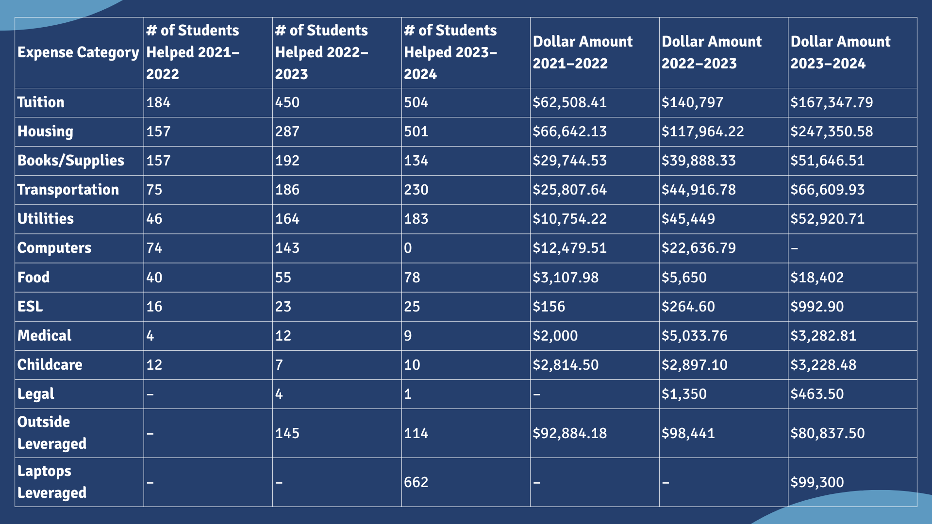
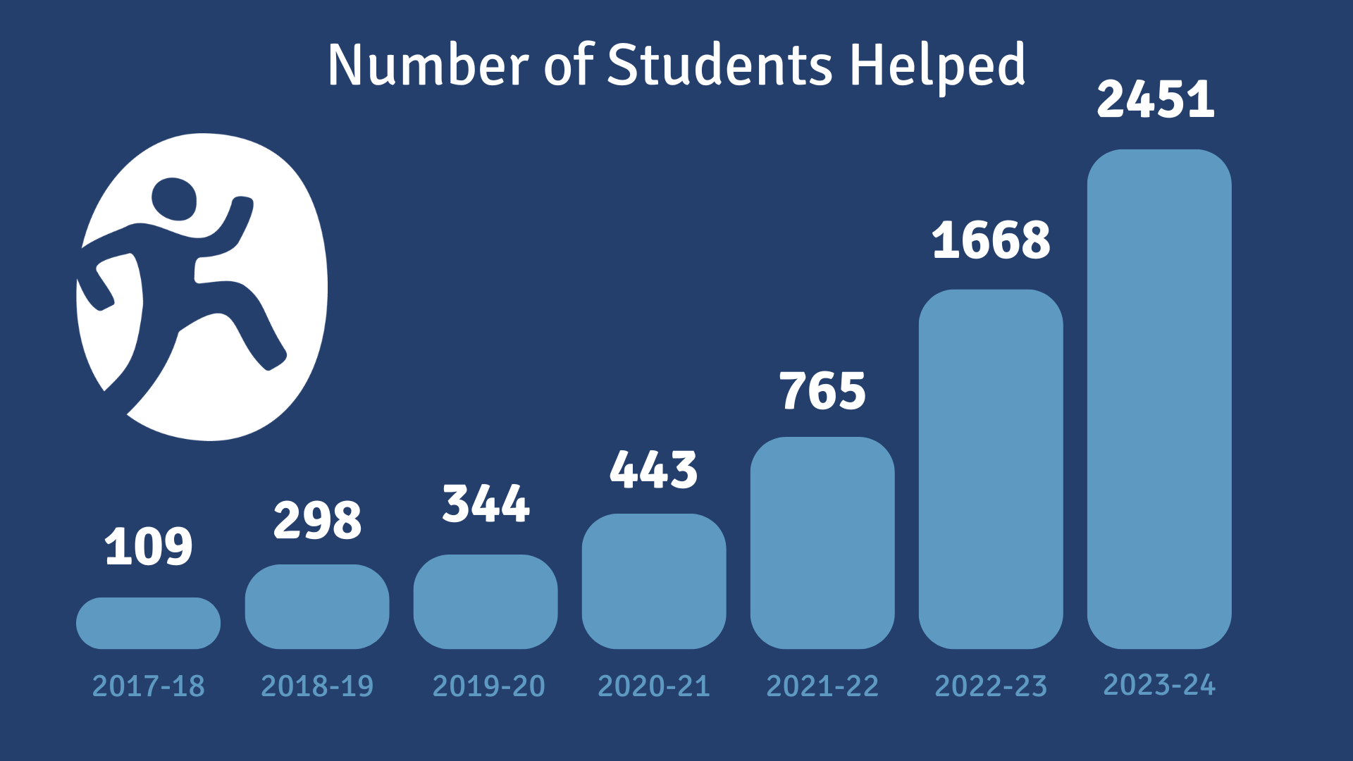
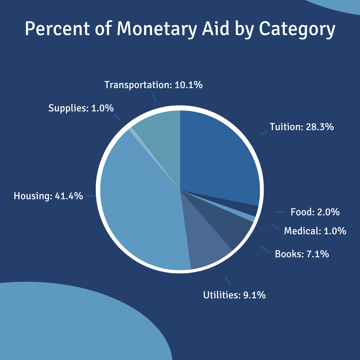
For the home page, we focused on fast and direct communication. To ensure students know they are in the right place, we have a quick explanation of the organization. As you scroll down, there are buttons for quicker navigation to common parts of the website and charts showing data on giving and funding. The charts were rebranded to bring both color and typeface in brand.
In addition to the chart updates, we made custom, people-centered, icons. These are applicable for multiple parts of the website and print materials. We also have the star icon to replace the basic white star used throughout the old website.
Overall, we wanted to create a simple and direct landing page with key information for both students and potential supporters. This way, the message Fast Fund wants to send to any audience is clearly communicated in the correct tone.
Modernize, Harmonize.
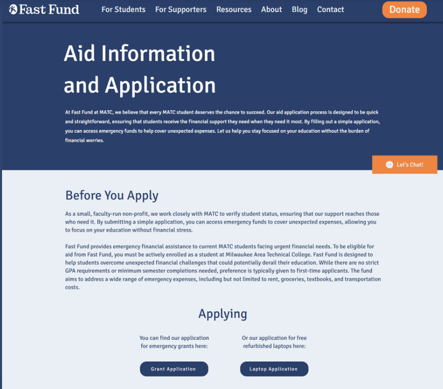
On each webpage, we added a simple banner to top. This was both as a navigation indicator, but also for the most important information a student or supporter may need to maintain interest or confirm crucial information will be found on that page.
Because we added dropdown menus, content on each page is short. This allows for easy reading and quick navigation. We added images to break up long instances of text and organize repetitive looking information.
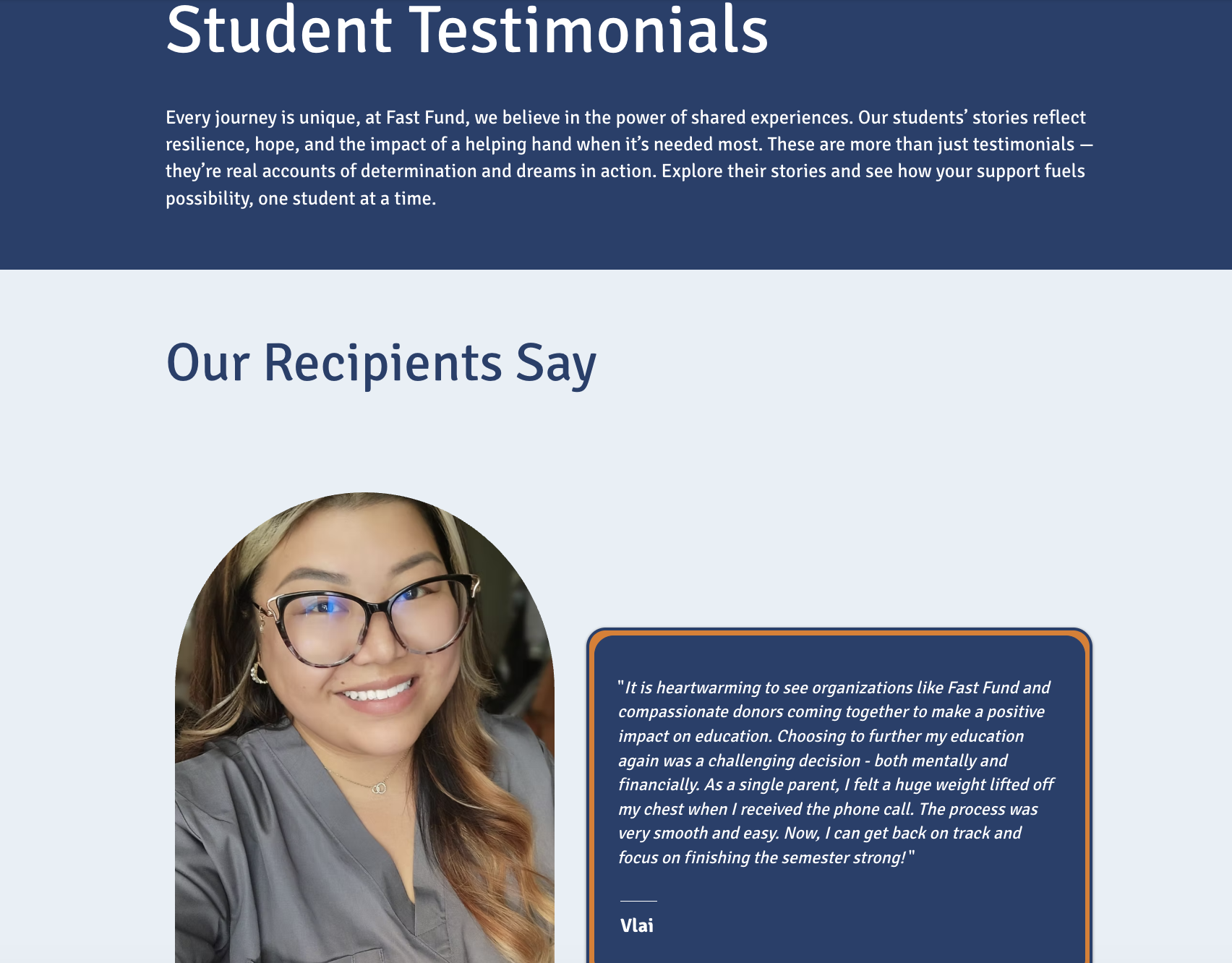
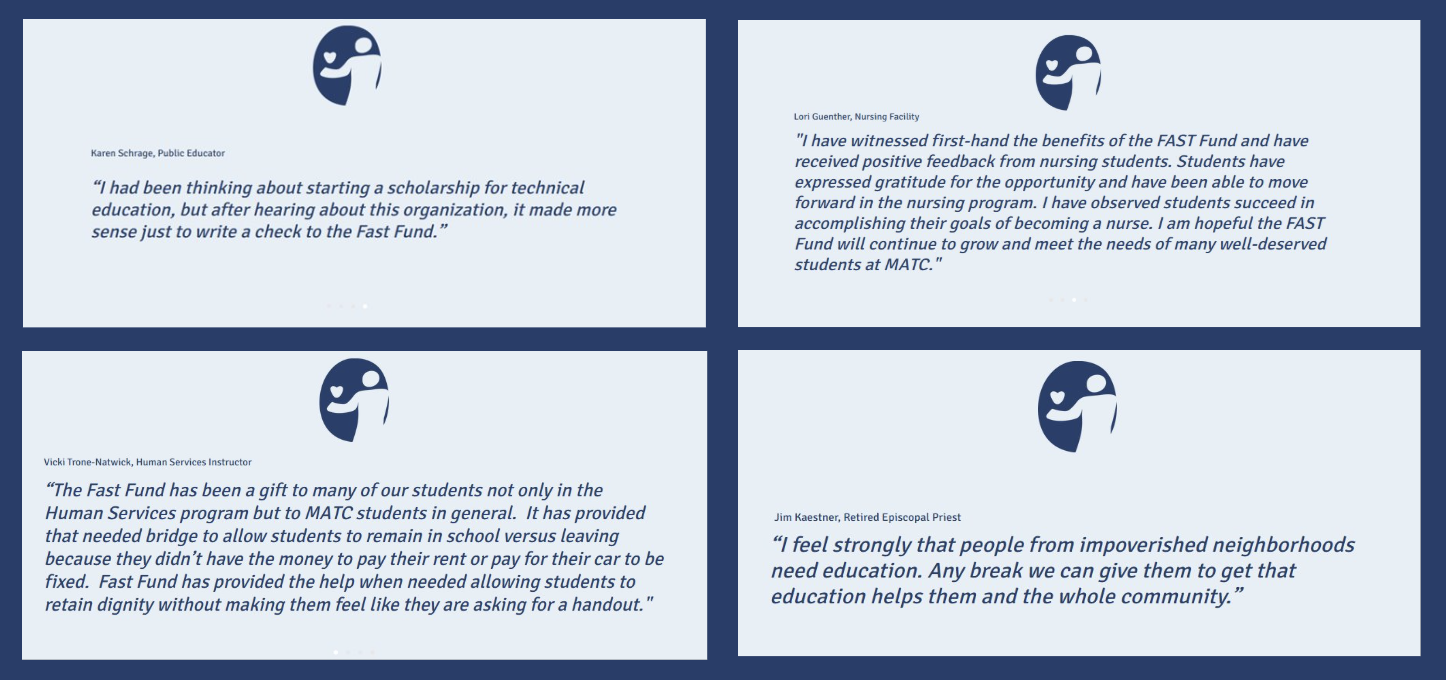
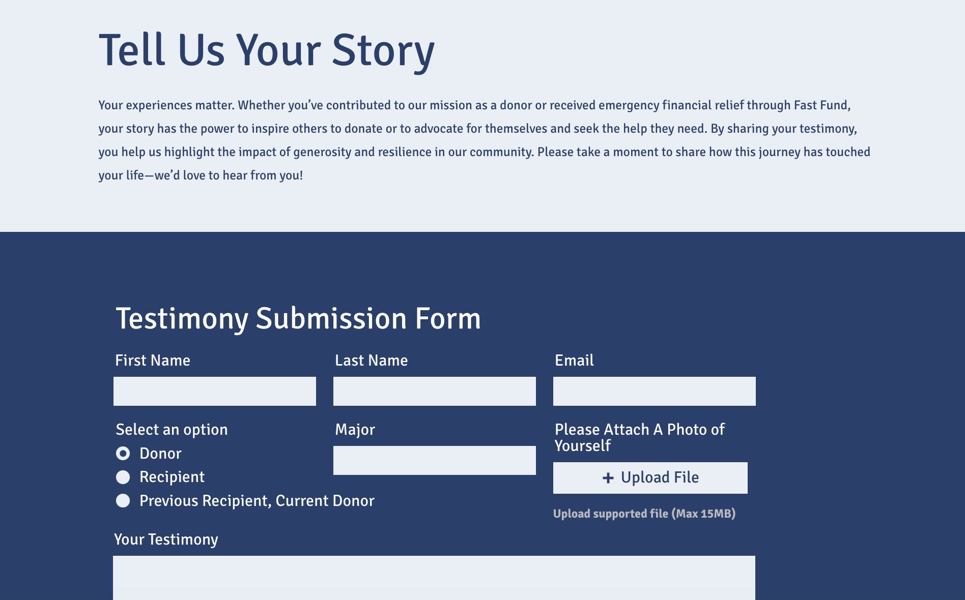
We modernized in-site information that crowded previous pages by utilizing slideshows. This worked especially well for recipient testimonies and stories from those in the Fast Fund community. This way, text that previously looked similar and lengthy is broken up by each slide. Furthermore, we embedded all previously external forms.
We added special pages, such as in the aid section, for Spanish. This was to ensure accuracy so students don’t have to rely on a faulty web translator.
Hot off the Press
Front
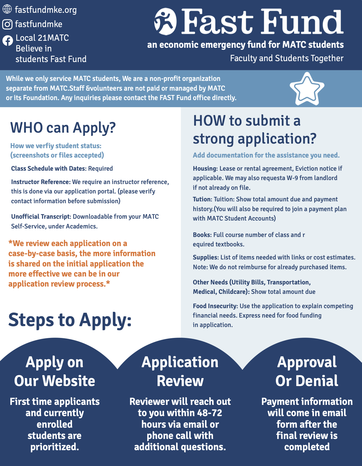
Fast Fund’s one-pager contains a great amount of information. We prioritized categorization, brand recognization (for those walking by or searching for the document), and brand voice.
New!
Back
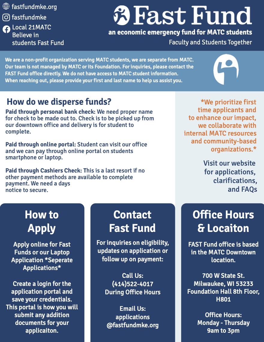
The organization needed a large amount of information on a small space. To organize this information, we used color, typeface, and icons. To make the best use of the space given, we condensed the information to the most crucial details students may need for context and next steps. This one-pager would be found both in Fast Fund’s office, but also in the halls of MATC. We used a heavily branded the document so it would be easily recognizable to students in a rush, those with a language barrier, or those in need of Fast Fund’s assistance.
Style Guide
The Brand Book:
The Key to Visual Identity
Stories and Structure
Fast Fund is largely run by volunteers. With this, there is constant turn over. The brand book focuses on the story and mission of Fast Fund, education on brand usage, guides & tutorials, and brand activation.
The story of Fast Fund is explained both to communicate to students with the right tone, but also to educate those working with the nonprofit.
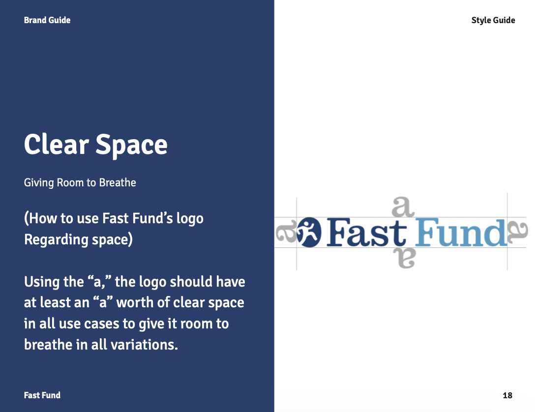
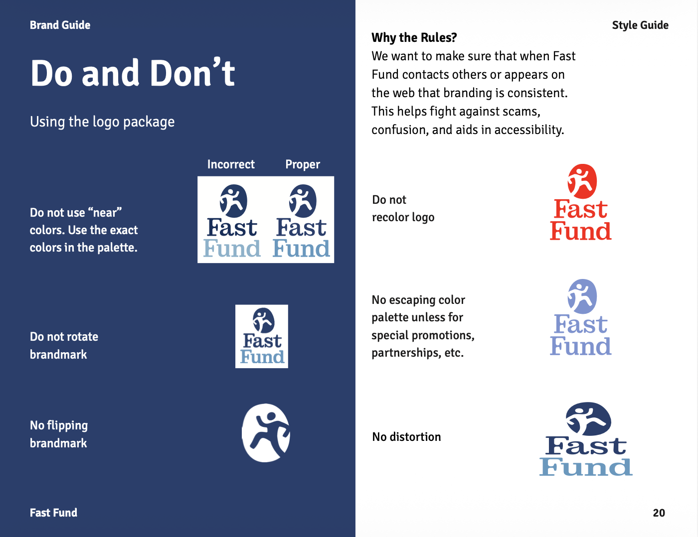
Classic style guide instructions are included like how to use the logo and colors, but also special instructions. Instructions on how to create and archive web pages, how to update charts and images, and how to use certain software is mentioned. This is a special addition to this brand guide to have an easier time educating volunteers.
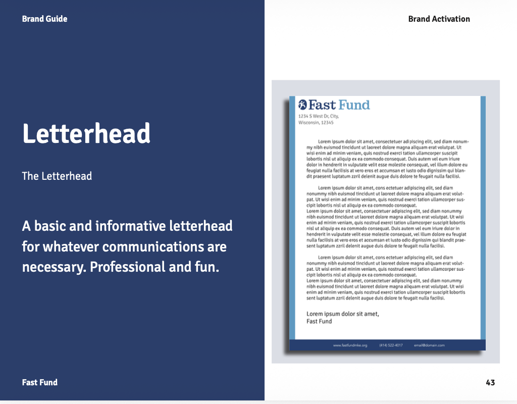
Brand activation includes stickers, business cards, and a letterhead. With any community - you want to stay connected!