Genesis Electric
From the ground up! Complete branding package. Website to launch late 2026/early 2027.
Role: Designer, Social Media Foundations, Web UI/UX

The Process


In The Beginning…
Genesis Electric is a family-run company providing homeowners and commercial spaces with quality electrical work. They are faith based with the tagline “Let There Be Light”.
With no previous branding, we started with three concepts. The first idea included a cloud to symbolize heaven. The second was a simple and vintage type concept to reflect family and simplicity. The third has a lightbulb integrated in the word mark for a bold and fun feeling.
All three concepts were completed in a matter of 24 hours to get the ball rolling on a vision as no prior branding existed,
The Cloud
Direct and Sharp
I wanted one design out of the three presented to be on the nose.
I used a modern, stylized typeface to convey strength and proficiency. It is crucial for electricians to be up to date on proper codes, safety regulations, and to work with efficiency. A modern typeface conveys that though the company is small, it is strong and current.
The cloud with the lightbulb in it conveys heaven, but also James 1:17 “ Every good and perfect gift is from above, coming down from the Father of the heavenly lights, who does not change like shifting shadows.” It carries the weight of what the company truly stands for and with.
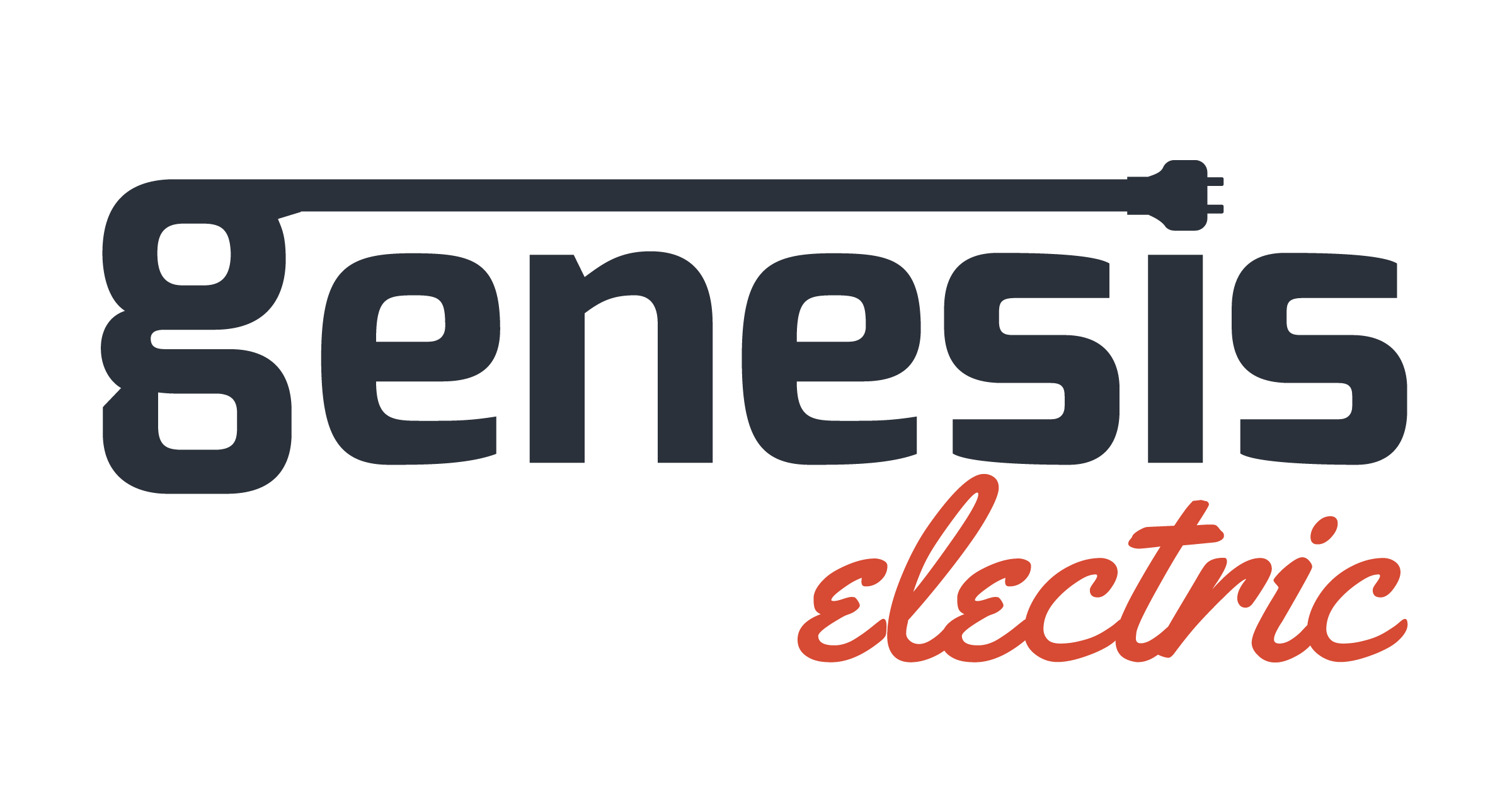
The Plug

Classic and Fresh
Genesis Electric is a family owned business. To convey the feel of being home, I used a classic troupe used in vintage design with the main word in a more standard typeface with the second one in a script. I chose one that was balanced and legible.
For “genesis”, I chose a modern typeface to contrast the script and bring the past to the present. Using the plug as the dot of the “i”, it shows quality connection and precision.
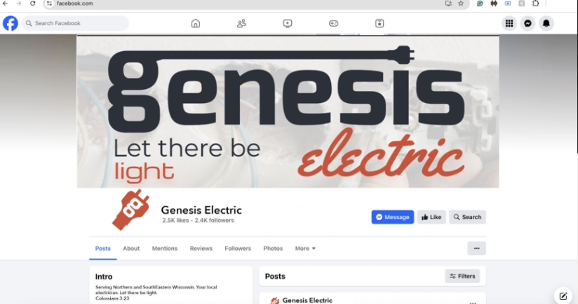
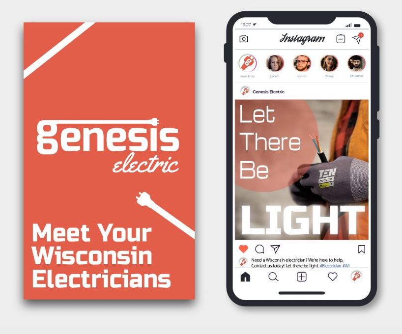
The brandmark is the plug with the Genesis “g” nestled inside. The plug remains a graphic device across different platforms.
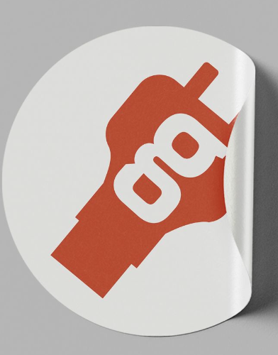
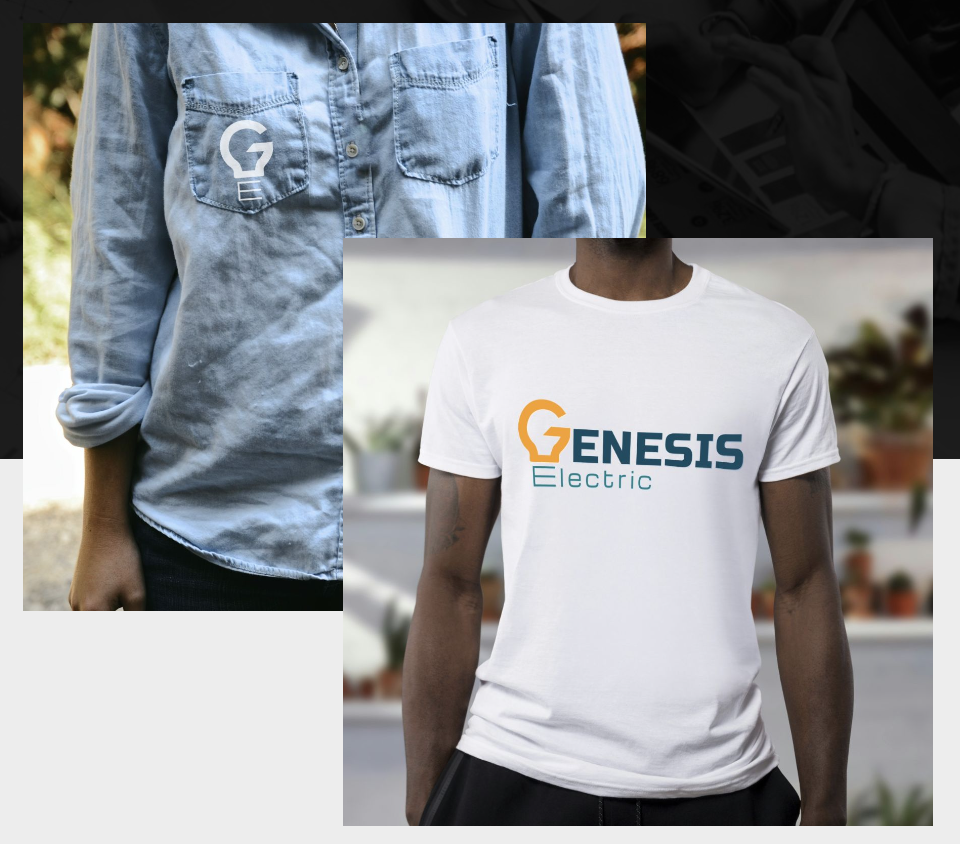
This concept was used to model social media and brand activation. It consists of reds and whites with neutrals to contrast.
For social media overall, the focus was placed on simplicity, friendliness, and connection. The customer should be able to easily navigate social media, knowing who Genesis is and what they stand for. Simplicity is used as the method for quick and easy visual communication - for information and brand identity.
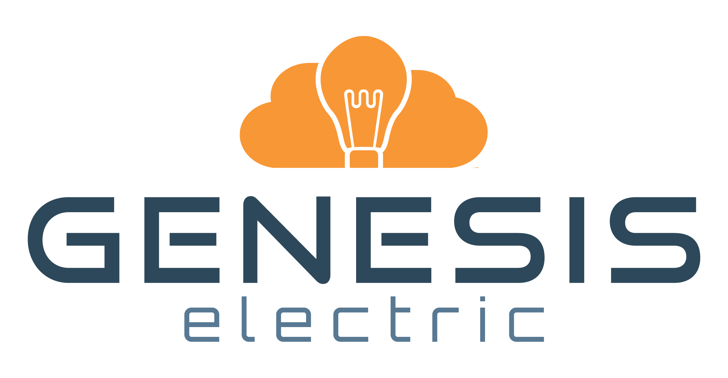
Let There Be Light
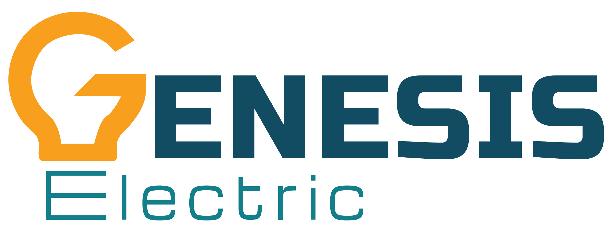
The Lightbulb Moment
The chosen logo was the one that incorporated the lightbulb into the wordmark itself.
This logo was created over many revisions, The type on the G was heavily iterated on in order to create a legible “G” while also creating the shape of the bulb. Using the same typeface as the rest of the “Genesis” word as a base, the top of the icon was created with the help of the pen tool as a vector itself. The modern and bold typeface of the word conveys strength in quality of work and pride in that workmanship.
The word “Electric” functions as the shaft of the lightbulb and a soft and clean contrast to the main word of the wordmark. The typeface is modern and easy on the eyes. It supports the main word instead of fighting for attention.
Overall, the wordmark clearly conveys the concept of light with a fun and approachable stylization.
Where We’ll Go
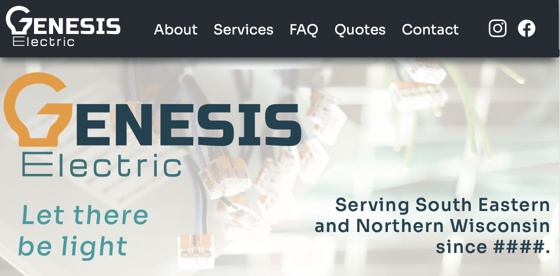
Genesis Electric:
Coming To The Web!
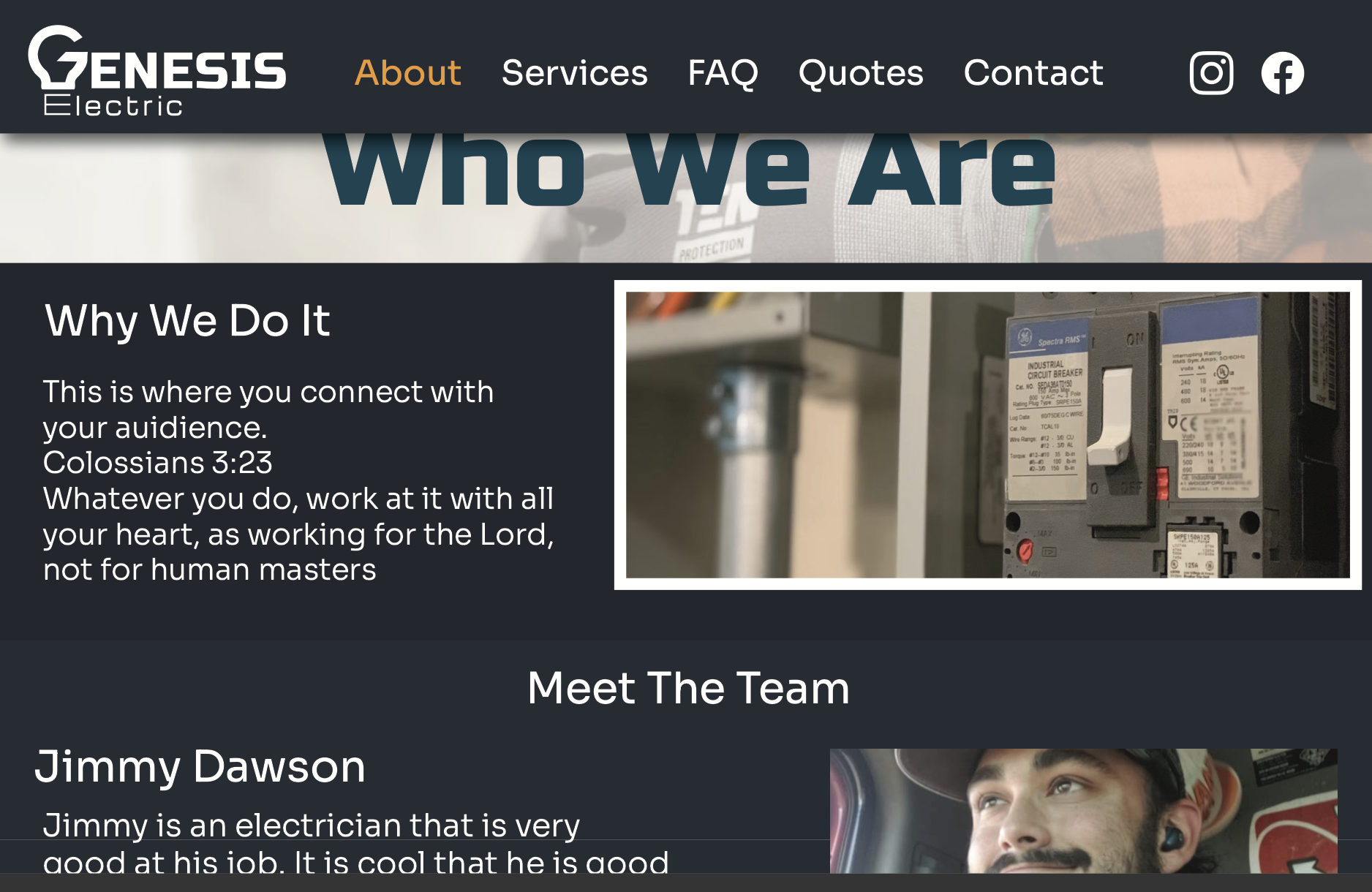
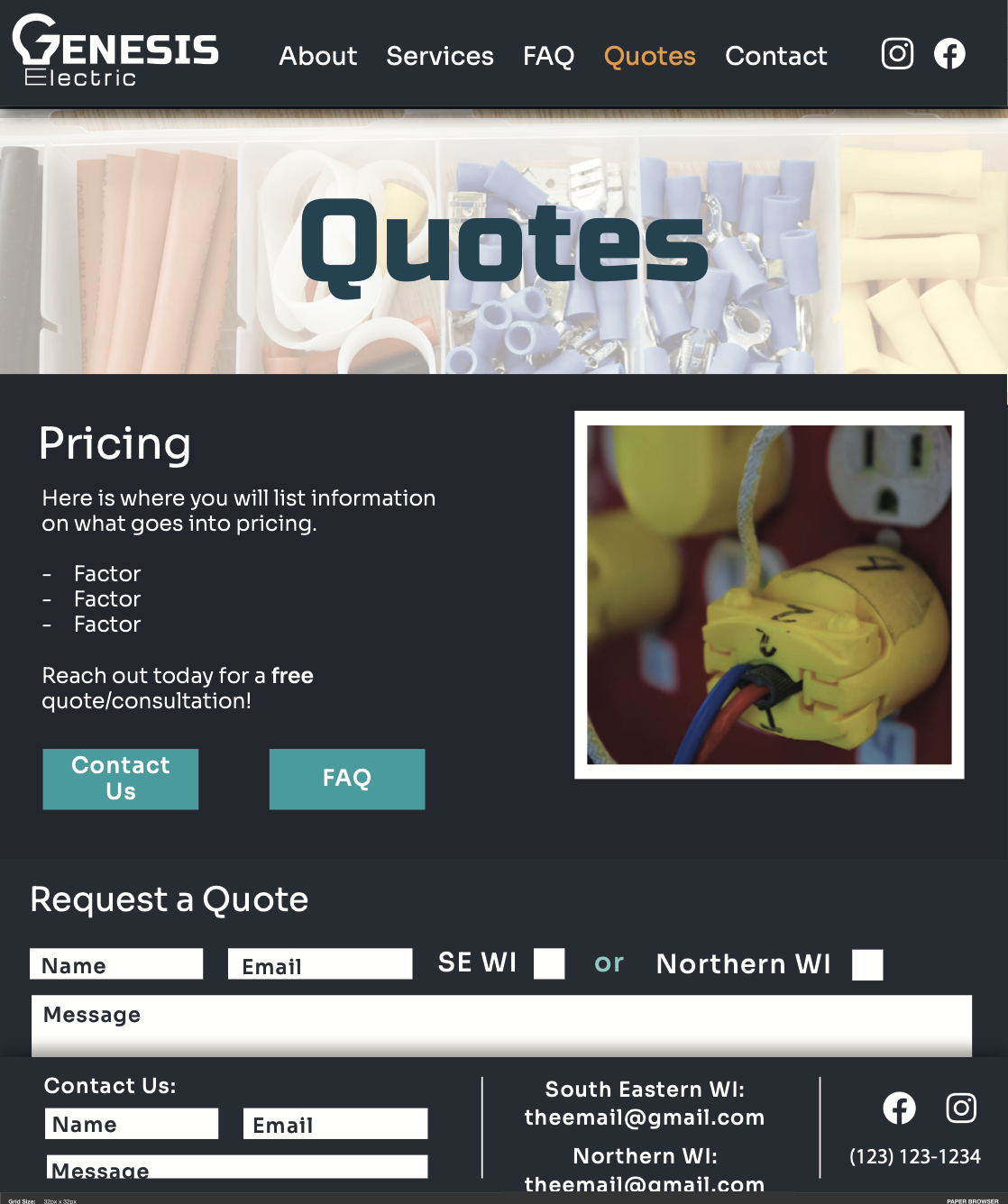
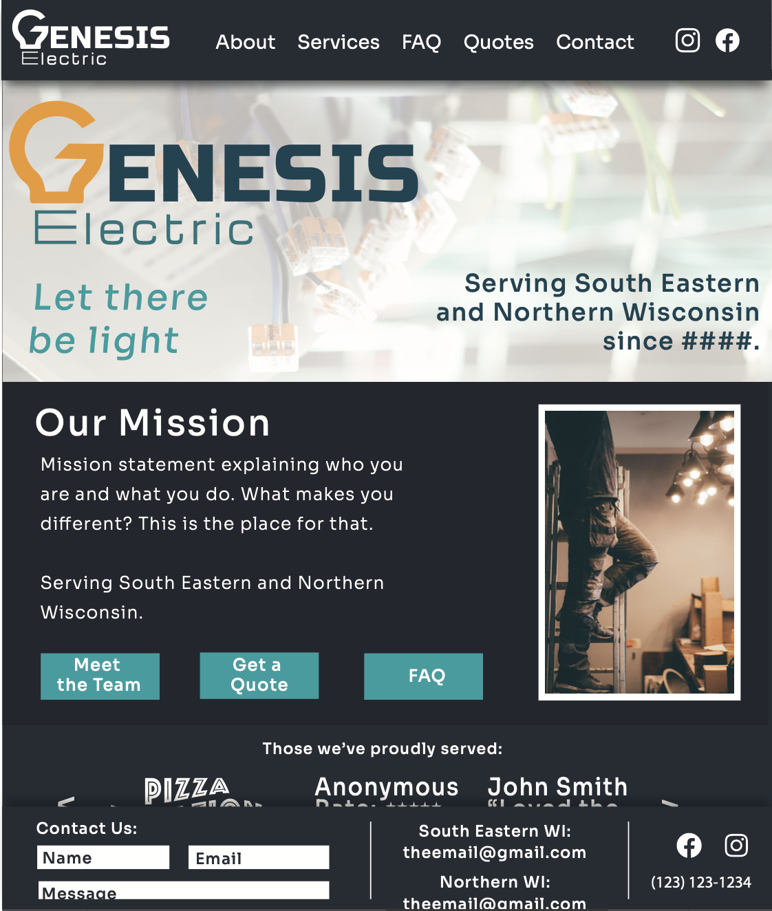
Wireframes
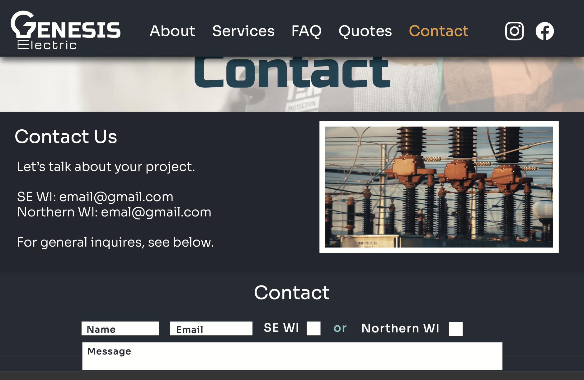
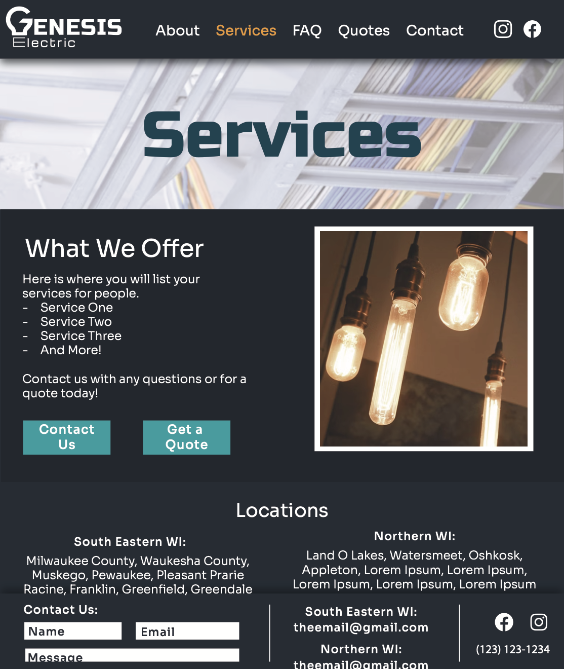
Simplicity in communication is key for the website. It is crucial to clearly communicate who Genesis is, where they are, and how much they’ll do it for!
The website will emphasize being local to Wisconsin (with service north and south), being family-owned and approachable, quality of work, and the faith base. This is to communicate the quality of work received by the business.
More details on the website coming soon!
Brand Activation: