Caleffi Hydronic Solutions
Marketing & innovating. Strengthening brand presence and outreach through design.
Role: Marketing Graphic Designer
Timeline: September 2025 - Present
The Workflow.
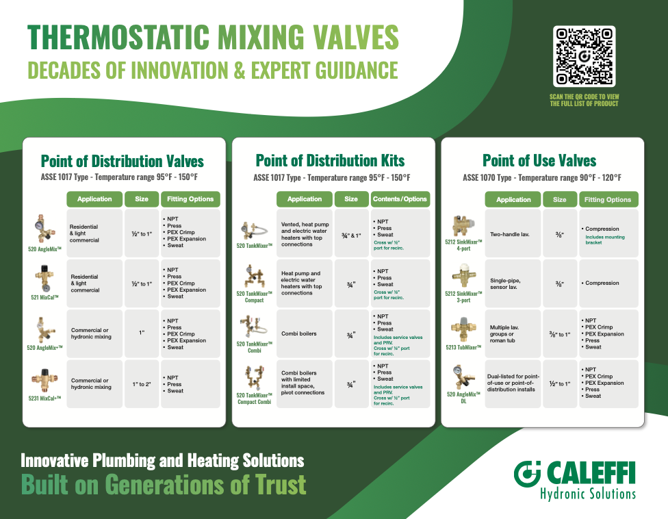
What I’ve Been Up To:
Brand Development & Consistency: Contributing to the development and refinement of established company branding in typography, graphic assets, and guidelines.
Graphic Design & Marketing: Design and produce a wide range of original branded assets for print, digital communications, advertising, and social media, as well as utilized previously established templates.
Digital Innovation & Development: Independently conceptualize, design, and develop functional digital tools, including an interactive KPI dashboard, using completely original design and vibe coding for the HTML.
Workflow & Process Improvements: Identify opportunities to improve existing systems and implement practical solutions, including the integration of editable Bitly pages into printed materials to maintain long-term functionality.
Efficient, Consistent, and Fresh.
My role encompasses a broad range of creative, technical, and marketing responsibilities.
I contribute to the company's visual identity, develop original design solutions, and create materials that support both internal operations and external communications. My work extends beyond traditional graphic design, managing multiple projects across different disciplines simultaneously.
Catalog Design & Production: Contribute to the annual company catalog, including layout development, formatting, product presentation, and adherence to established brand guidelines.
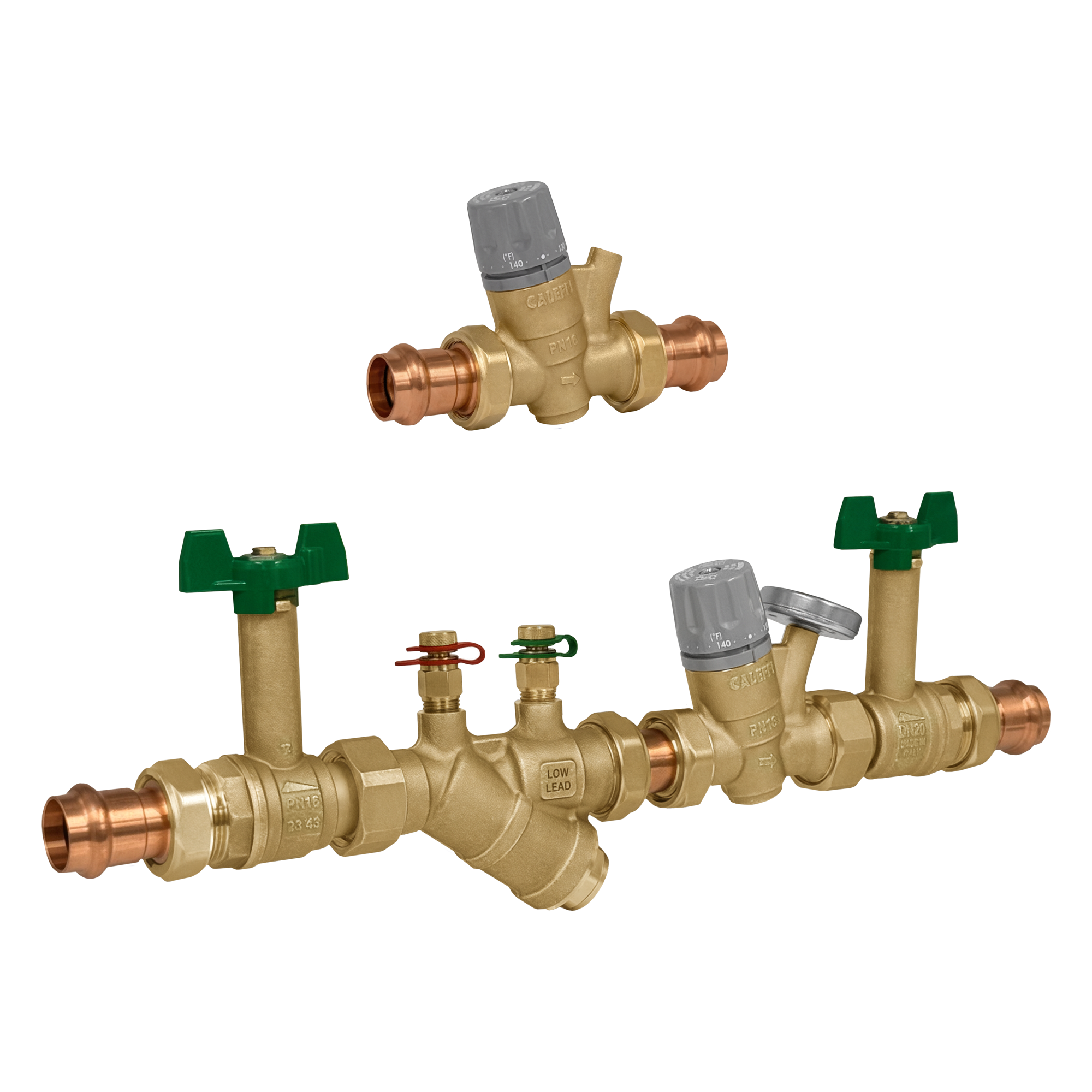
Photography & Image Editing: Shoot, edit, and retouch product photography, professional headshots, and other imagery for use across catalogs, websites, marketing materials, and professional applications.
Technical Documentation & Literature: Before a Technical Writer joined our team, I would, format, and refine technical documents, instruction sheets, and company literature. I’d managed multiple documentation projects concurrently alongside ongoing marketing and design responsibilities.
Visual KPI Dashboard
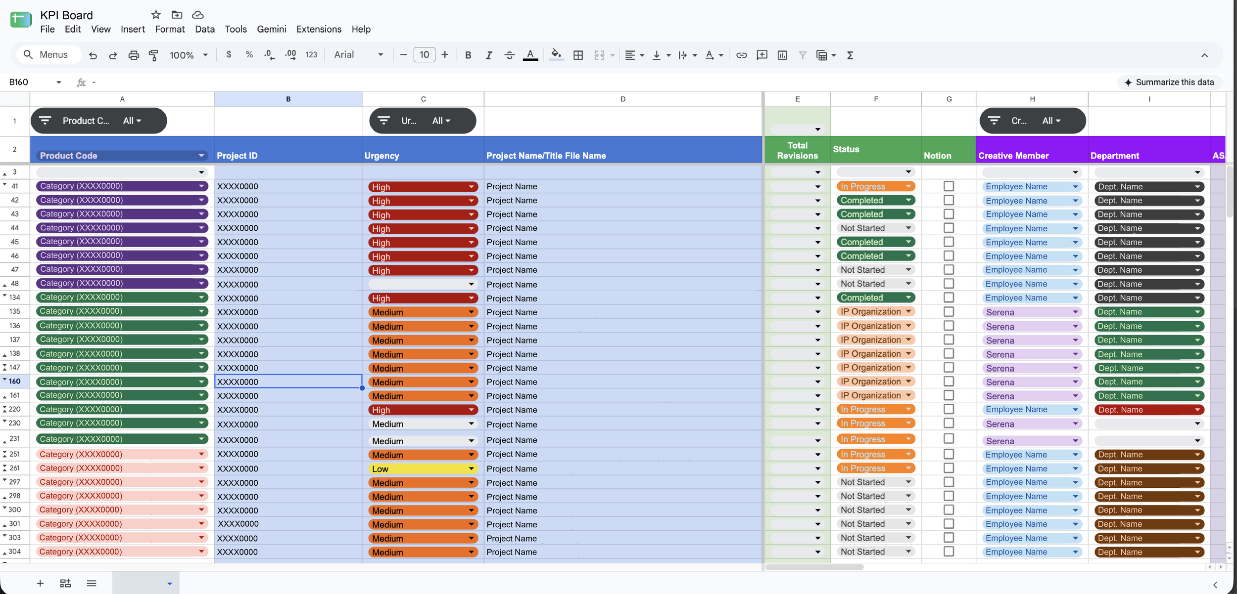
Before:
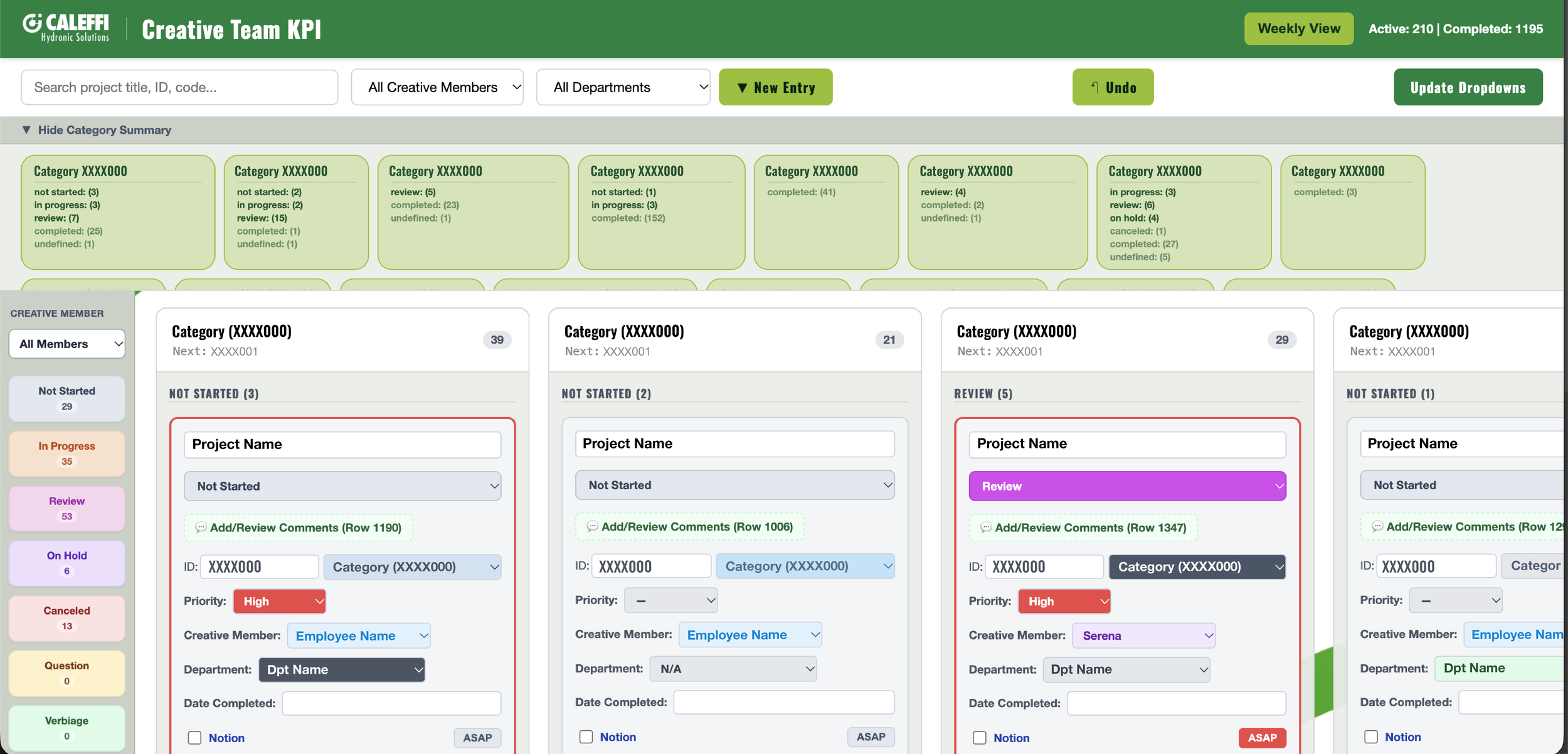
After:
See it to Believe it.
The creative team decided we needed a new and custom way to manage projects. We spent a few months using Google Sheets as a KPI tracker. But eventually, projects became difficult to find and organization was almost impossible. We knew something had to change, so I got moving.
The design for the KPI dashboard is 100% original design with zero AI assistance. I conceptualized and designed on paper to Adobe Illustrator. I then vibe coded the actual HTML and CSS for efficiency, both time and cost.
The spreadsheet remains 100% functional and can be used in tandem with the dashboard. The two are always speaking to each other so changes are simultaneously made.
In this board, you can organize by employee (and see only your projects), see what’s being completed on the day to day, see what’s completed by category, add entries, search, and see what you haven’t completed yet so you don’t forget something important!
The KPI tracker has changed the way we move. Projects don’t get shoved to the back of the shelf anymore, but everything is now in it’s place and on time.
Features of the Dashboard:
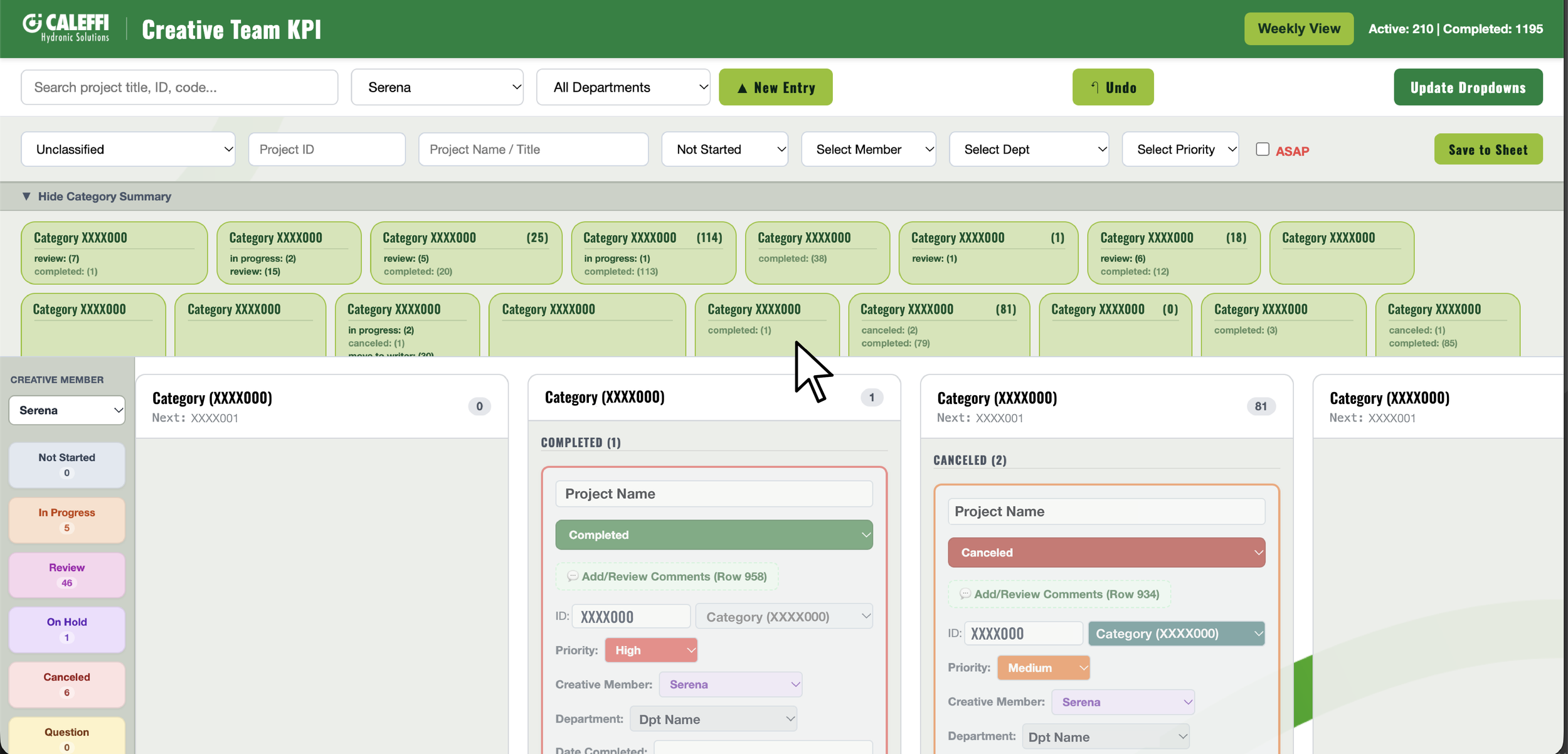
Organize!
If the categories are taking up too much space, just collapse them away.
On the left side, you can organize projects by creative member. This way, you only see what you have on your plate or what you’re waiting on the other members of your team to approve.
Press on the buttons in the creative member section and a new column will show with just that progress status. See everything you need to complete in a click.
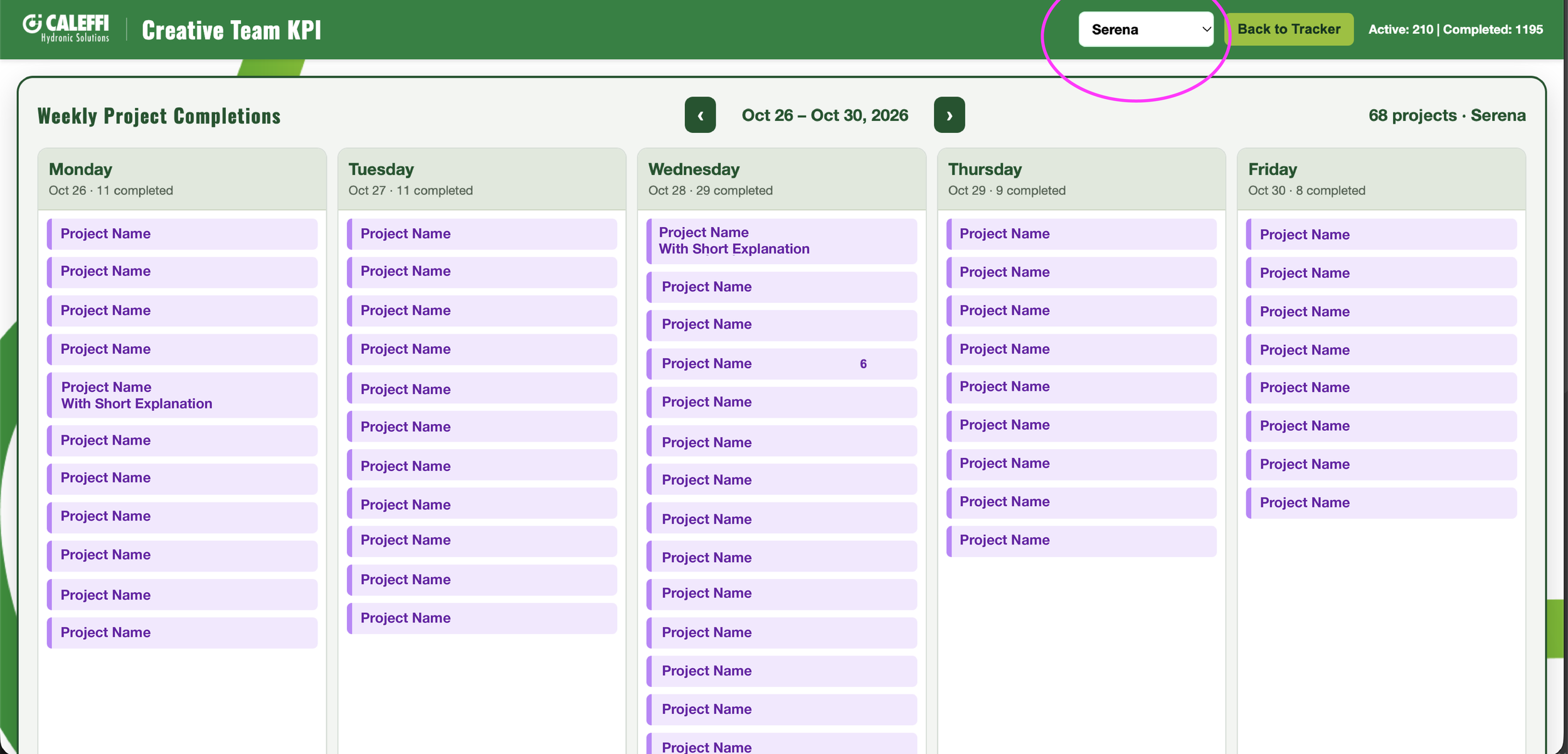
Click!
Just click a category to jump to it. You can also search in the upper left corner to find the project you want to see.
If a project is completed (even if it’s hidden in the spreadsheet), it will be automatically organized into the cells. It’s greyed out slightly to quickly indicate that it is no longer a priority.
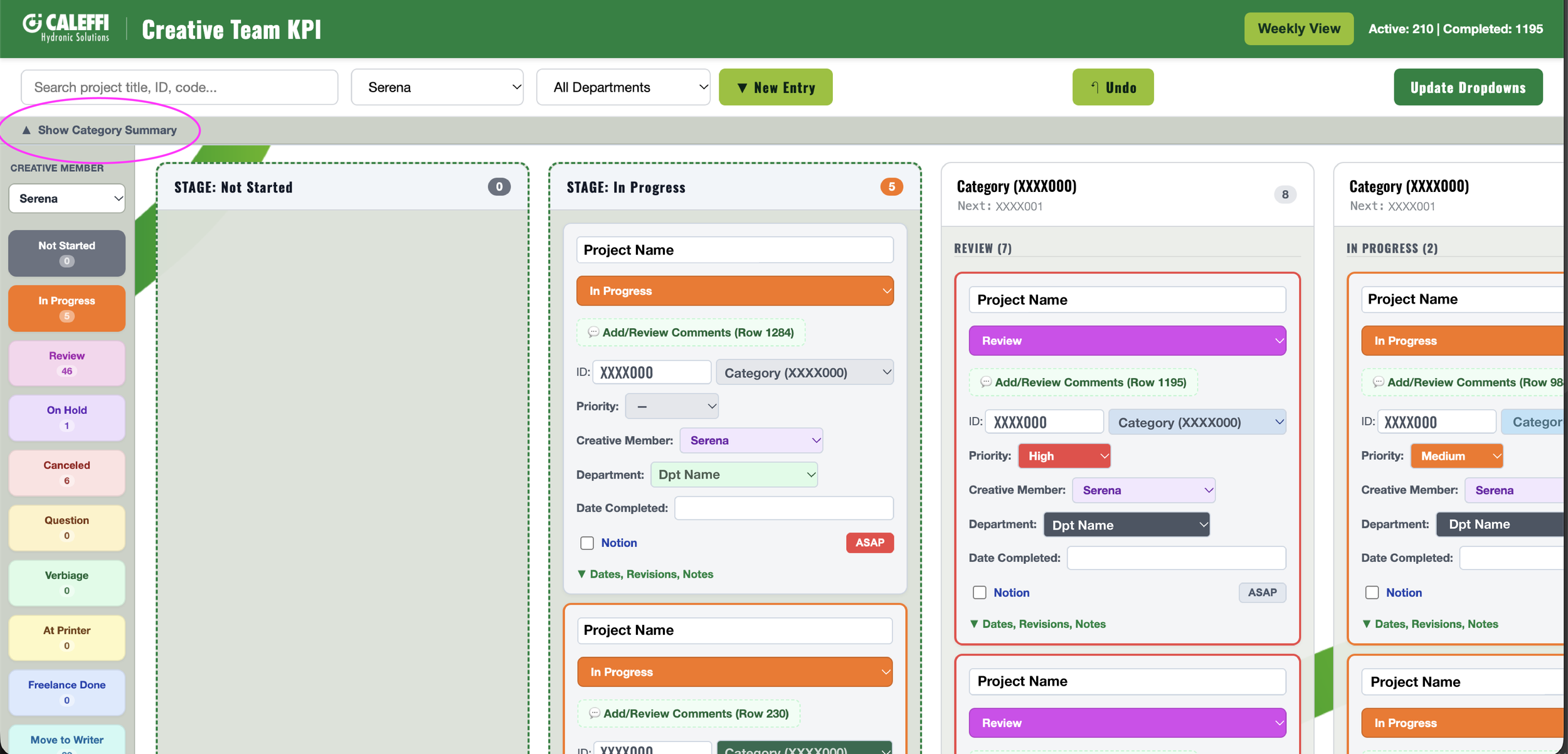
View!
If you need to keep track of what work you’re fully completing on the daily, go to the weekly tracker. It’s organized by “All”, or a specific team member’s name.
If you click on a project name, it will bring up the project cell as they appear in the dashboard’s home page.
This tool is especially helpful when you need to show the strength of your team! We know how to get it done in the creative department!
An Established Presence.

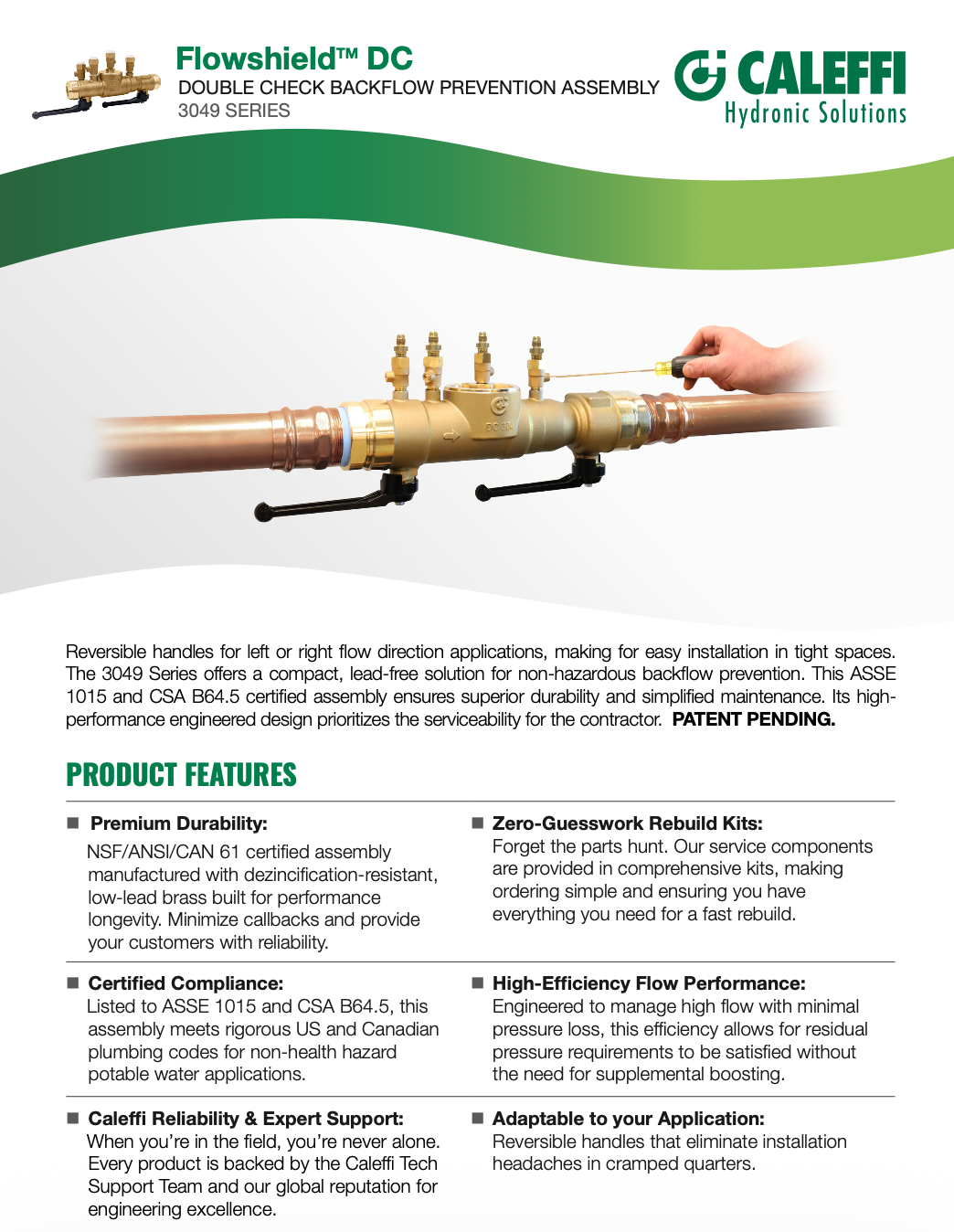
Strong Visuals, Strong Communication.
Consistent and Sharp.
Caleffi already has strong branding with a strong brand presence. So now, it all comes down to semantics. For a high quality product with immense thought put into it, the visuals must communicate the same thing. Actions I’ve taken are:
Standardized typography: Helped establish consistent font usage across company materials, narrowing down typography choices to create a more cohesive and recognizable visual identity.
Organized digital assets: Identified, categorized, and formally named frequently used graphics, turning previously scattered visual elements into recognizable, reusable digital assets.
Developed design templates: Created standardized templates with intentional spacing, visual hierarchy, and formatting to improve consistency across materials.
Worked within brand constraints: Translated internal feedback, overhead direction, and design restrictions into polished materials without sacrificing visual quality.
Refreshed existing collateral: Reworked older materials to better align with evolving design standards and create a more unified look across departments.
Improved visual cohesion: Addressed inconsistencies in typography, spacing, graphics, formatting, and overall presentation across a wide range of company materials.
Digitally Analog.
Caleffi utilizes a broad array of print materials, both internally and externally. The issue with print materials in a fast moving world is how quickly things become obsolete or need updating. But the problem? Print is fantastic! And people use it all the time. So how do we change the need to reprint or discard so often?
I saw an opportunity to make print more adaptable.
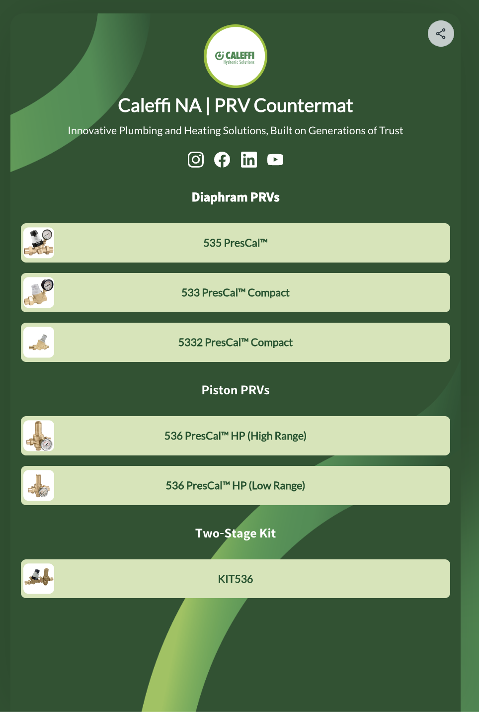
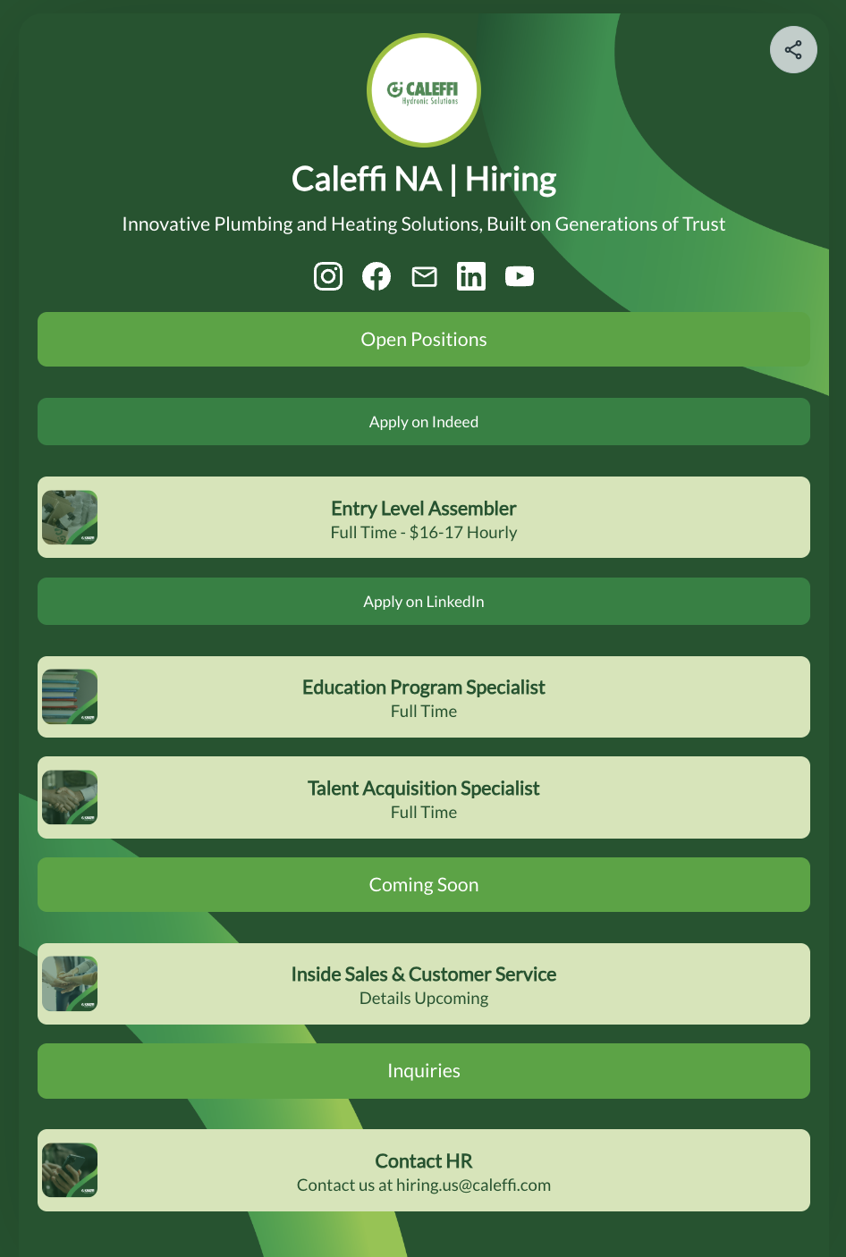
QR codes are a great way to bridge the gap between print and digital. But we took it one step further. My solution was to use Bit.ly pages! Now we’re able to update technical information, re-route those who interact with the QR, and change what we need to communicate in an instant.
Message isn’t as effective as anticipated? Something not in depth enough in the print? Page link destroyed, moved, or changed entirely? No problem, switch out what’s in the Bit.ly!
It’s a great way to have a branded landing page that’s easy to update.
We Are The Flow.
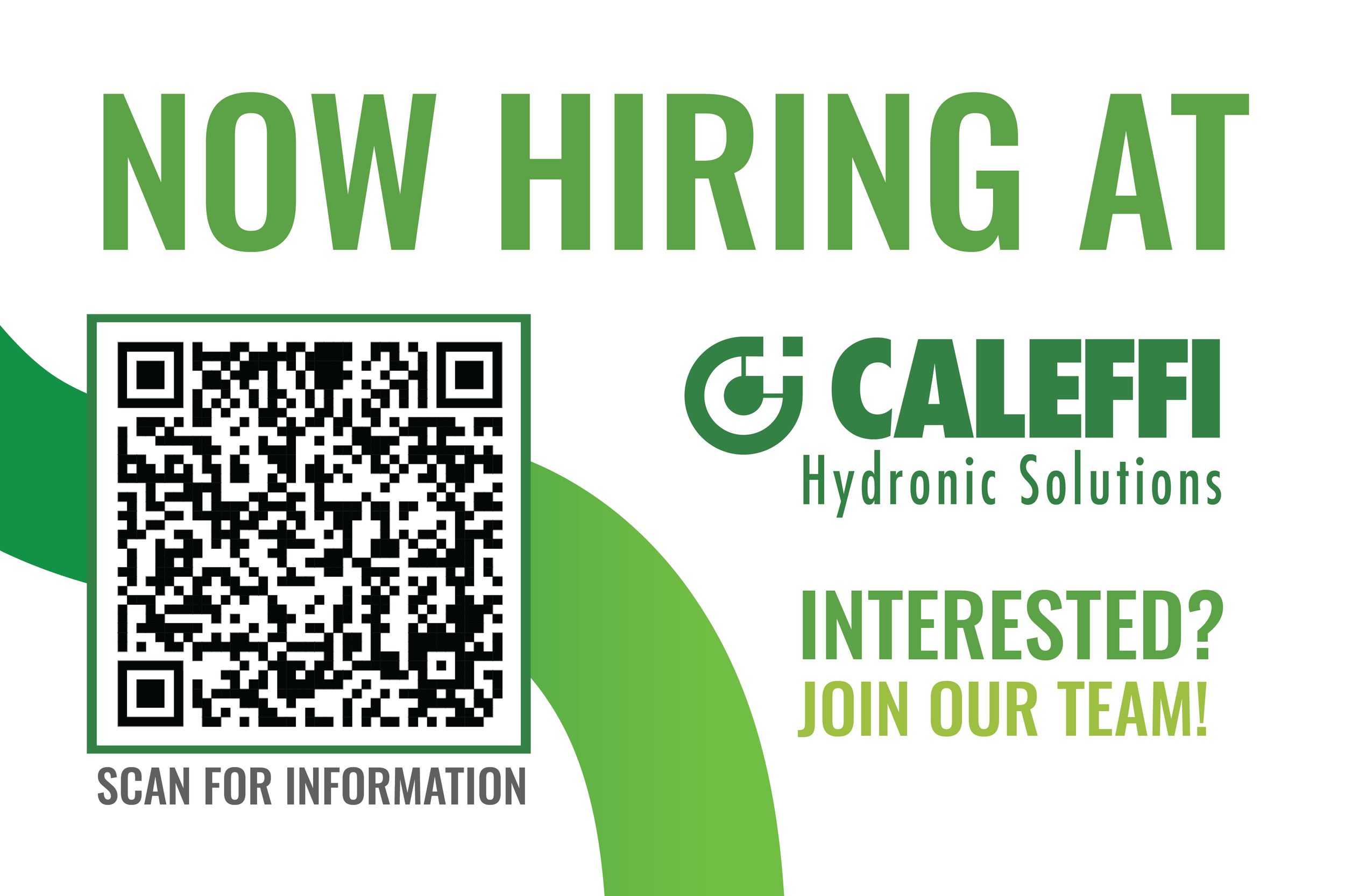
Marketing Materials
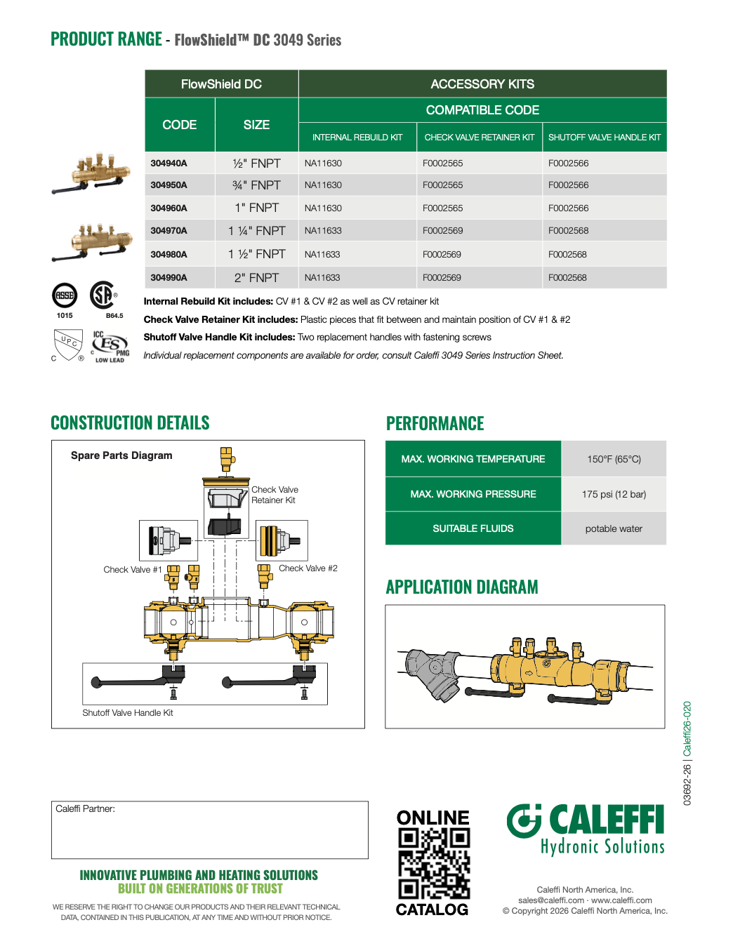
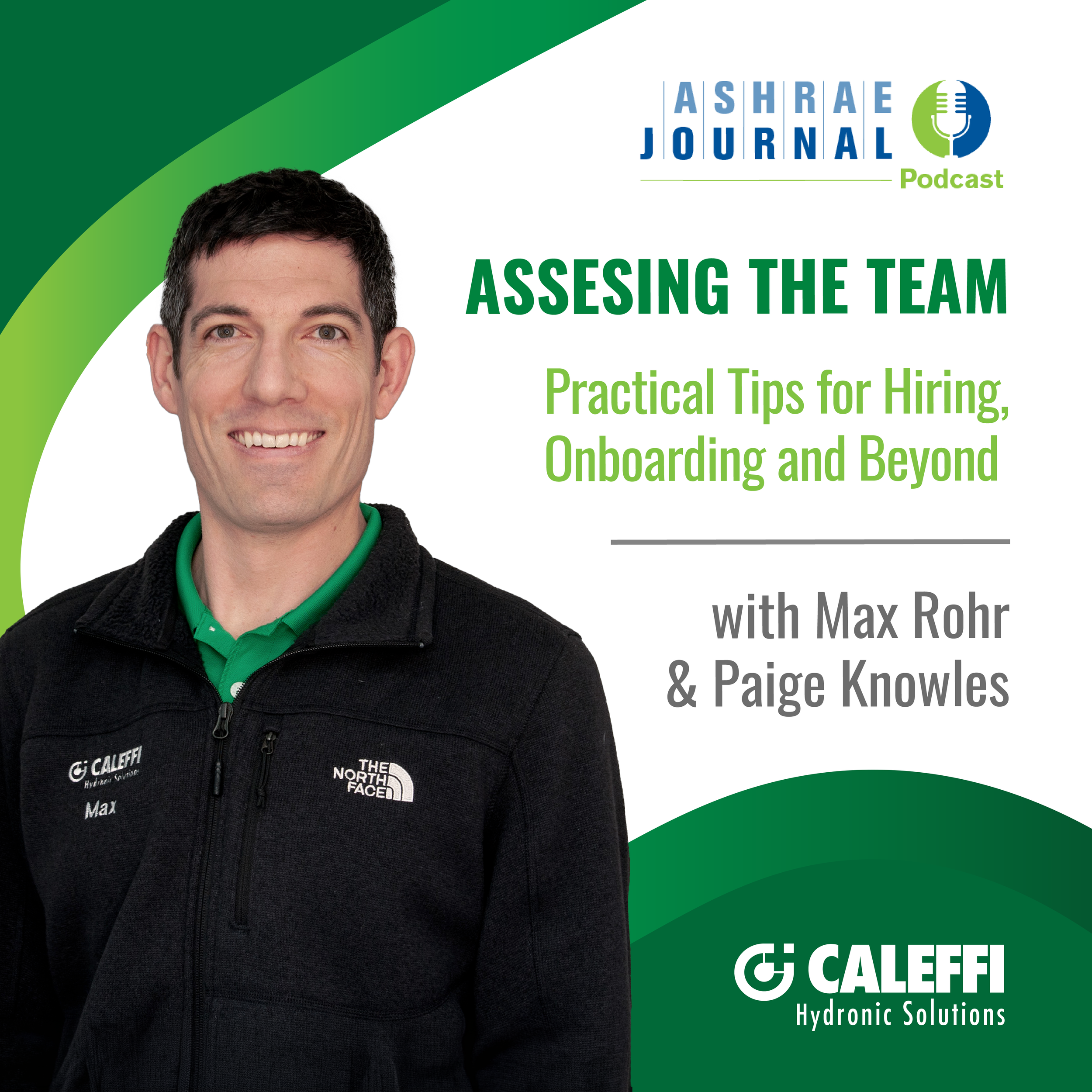
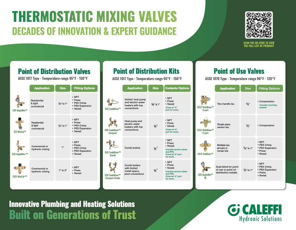
My work ranges from swapping out assets in templates to completely original material creation.
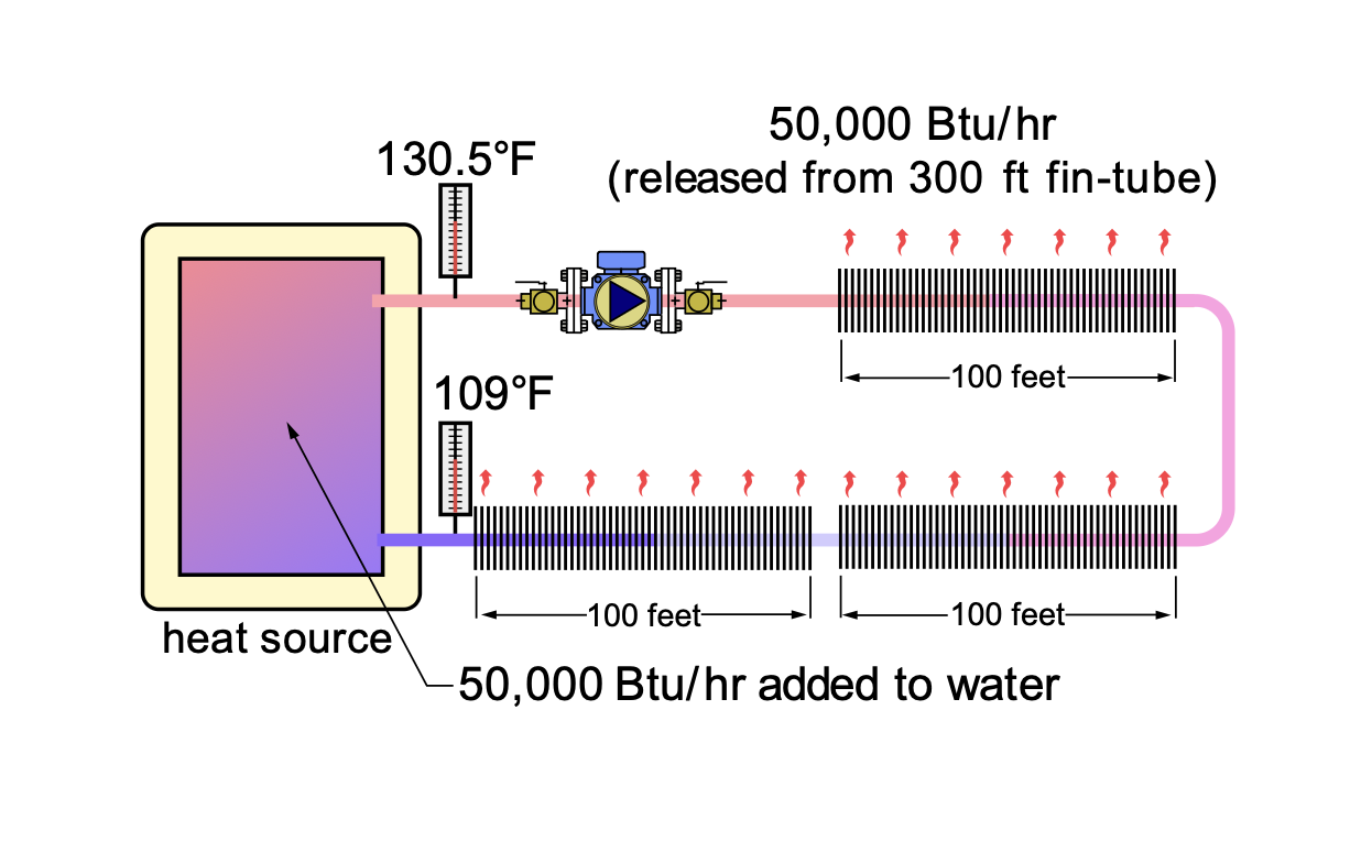
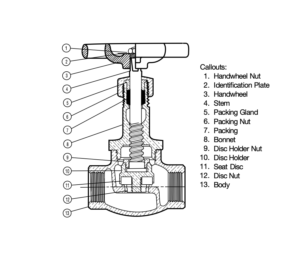
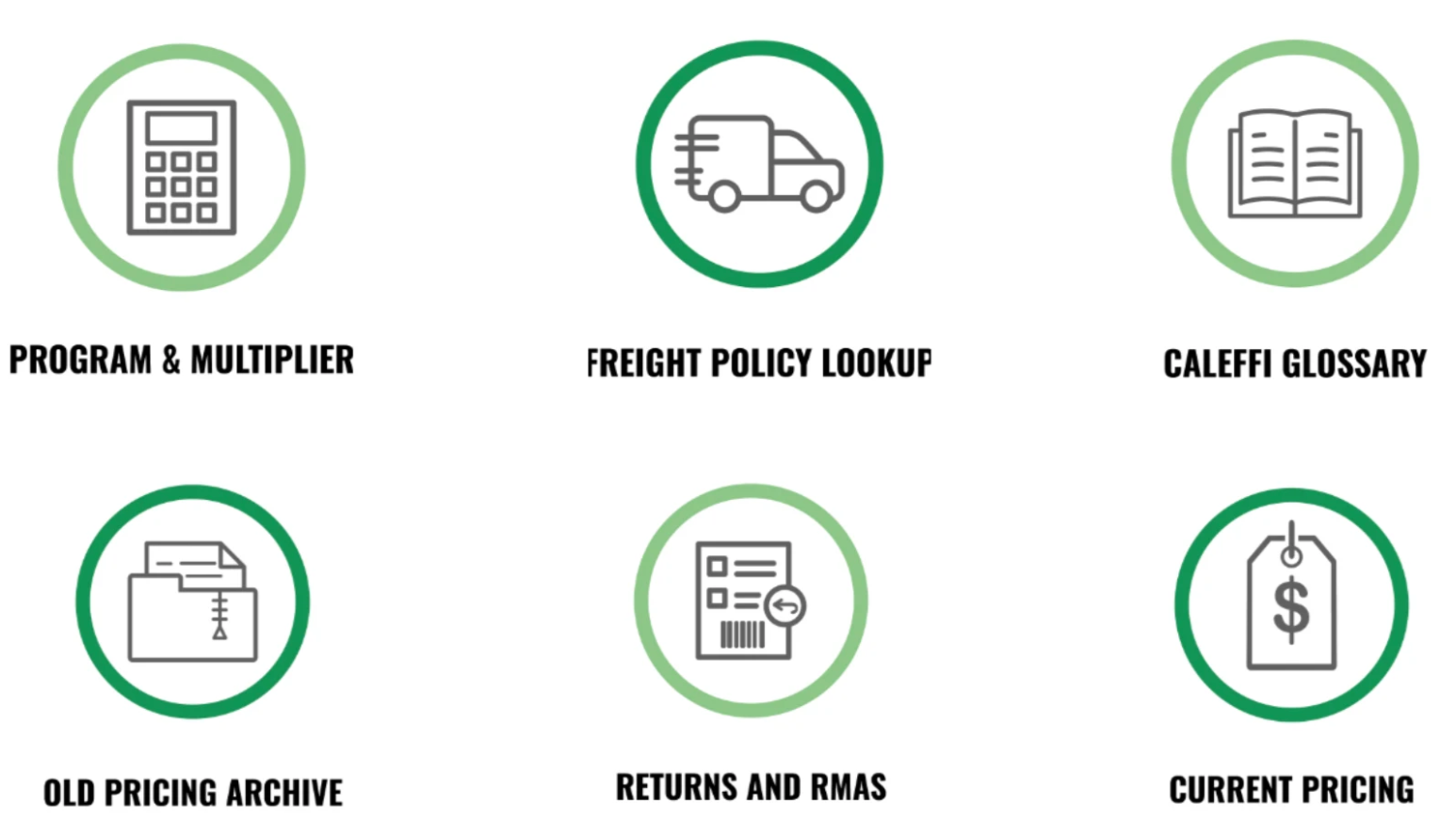
My work includes graphic recreation from older graphics or non-editable files to completely new and original schematic and diagrams.
I work cross-departmentally to address specific design needs, making needed changes while staying in brand and innovative.
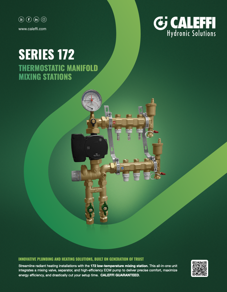
Those on the creative team work together to create stunning graphics, such as the 172 ad. This template was created, but slightly edited. Assets were swapped out and the product photo was edited by myself.
From eye catching icons to in depth construction details, I keep it in brand while keeping up with design trends that work for our home in Italy, and our target audience in North America.